Keynote Address to the Australian Business Economists Forecasting Conference by David Gruen, Chief Adviser (Domestic), Macroeconomic Group, Australian Treasury on 13December2005.1
Australia’s current account deficit (CAD) has averaged 4percent of GDP over the past two decades. This has led to rising net foreign liabilities, which have been accumulated almost exclusively by the private sector rather than the public sector. Net foreign liabilities have risen gradually as a share of GDP over this two-decade period but have fallen gradually as a share of private sector wealth over the past decade.
The CAD measures the extent to which Australia draws on foreign savings to fund that portion of national investment that is not funded by domestic national savings. It is therefore of interest to examine the rates of national saving and investment and their components through time.
Financial deregulation and house-price booms in Australia and other Anglophone countries have acted to reduce private saving rates in recent years. Those Anglophone countries with no recent decline in national saving rates (Australia, Canada and New Zealand) have achieved this outcome by significantly improving their government budget balances, and in Australia’s case, with the help of a compulsory private saving scheme. House-price booms in the Anglophone countries have also tended to raise dwelling investment as a share of GDP. In Australia’s case, the recent house-price boom has accentuated a four-decade trend rise in the share of GDP devoted to dwelling investment. Over the next several years, however, the share of Australian GDP devoted to dwelling investment may decline gradually as the house-price boom continues to wane, reducing this contribution to the CAD. At the same time, the contribution from business investment, and mining investment in particular, is likely to rise.
Introduction
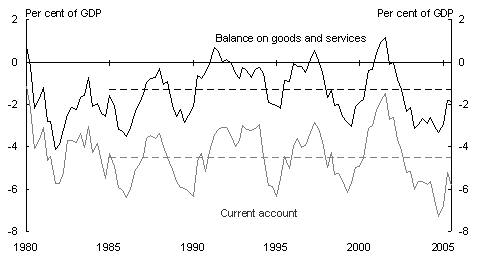
Thank you for the opportunity to speak to you this afternoon. I want to spend my time today talking about Australia’s current account deficit and what it means for public policy. Chart 1 is a good place to start this discussion. It shows the evolution of the current account deficit since 1980.
Chart 1: Current account and balance of trade
Note: Dotted lines show averages since 1985.
Source: ABS and RBA.
In the years before those shown in the Chart, Australia ran modest current account deficits. Over the quarter-century from 1959-60 to 1983-84, the Australian current account deficit averaged 2percent of GDP. Over the two decades from 1985 to the present, however, it has cycled between 1 and 7percent of GDP and averaged 4percent of GDP.2
The Chart also shows the balance of trade in goods and services. There have been brief periods over the past quarter-century when Australia ran small surpluses on trade in goods and services but during most of this time, imports have exceeded exports and the balance has been in deficit — by about 1percent of GDP currently.
Also shown, in this and several subsequent Charts, are averages over the two decades of sizeable Australian current account deficits since 1985.
The gap between the balance on goods and services and the current account is the net income deficit, which is the net flow of payments (primarily interest and dividends) on Australia’s stock of net foreign liabilities. The net income deficit is currently running at about 4percent of GDP.3
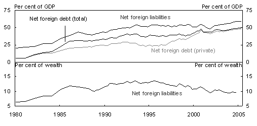
As a consequence of running sizeable current account deficits for the past two decades or so, there has been a rising stock of net foreign liabilities over this time. Chart 2 shows two measures of this stock of net foreign liabilities. In the upper panel of the Chart is the measure most commonly shown — the ratio of net foreign liabilities to GDP. Also shown in this upper panel are the ratios to GDP of net foreign debt and net foreign private debt. These series highlight the well-known point that Australia’s foreign liabilities are almost exclusively private-sector liabilities rather than public-sector ones, as they have been for some time.
Chart 2: Net foreign liabilities and debt
Note: Bottom panel shows ratio of net foreign liabilities to Australian private-sector wealth.
Source: ABS and Treasury.
Although the upper panel of Chart 2 is the most common way to show these data, it is in some ways an unusual way to present them, because net foreign liabilities and net foreign debt are measures of the stocks of liabilities and debt, while GDP is a flow. It is therefore also of interest to show the ratio of the stock of net foreign liabilities to the stock of Australian wealth, which is shown in the bottom panel of Chart2. Since net foreign liabilities are private rather than public, we use a measure of Australian private-sector wealth for this comparison.4
Net foreign liabilities have risen as a proportion of GDP almost continuously over the past quarter-century, as the upper panel of Chart 2 shows. Net foreign liabilities as a proportion of private-sector wealth also rose fairly steadily from 1980 to the mid 1990s. But from the mid 1990s onward, this ratio has been falling because private-sector wealth (after adjusting for the rising stock of foreign liabilities) has risen more strongly than net foreign liabilities. This in turn reflects strong rises in the value of both dwelling assets (up by an estimated factor of 2.9 from 1995 to 2004) and business assets (up by an estimated factor of 2.5 from 1995 to 2004).5
It may well be that the ratio of net foreign liabilities to private-sector wealth gives a more realistic measure of the evolving burden of foreign liabilities on the Australian economy than the ratio of net foreign liabilities to GDP, although it is also likely to be a more volatile measure.6
The discussion thus far, and particularly Chart 1, focuses on the current account from the perspective of trade in goods and services and net income payments. This is a valuable perspective, and one that I will return to later in my talk. Before doing so, however, I want to spend some time discussing the current account from the perspective of savings and investment.
Saving and investment
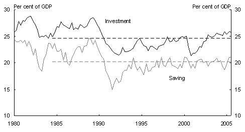
Chart 3 shows Australian gross national saving and investment since 1980, both as proportions of GDP.7
Chart 3: Australian gross national saving and investment
Notes: Ratios use current price data. Dotted lines show averages since 1985.
Source: ABS and Treasury.
The ratios shown in this and subsequent Charts use data on nominal investment and GDP, rather than real. This is because our focus is on implications for the current account, which is measured in dollars and is a nominal concept, rather than on the size of increments to the economy’s physical capital stock.
The gap between national investment and national savings is the current account deficit.8 Or
to put it in other words, the current account deficit measures the extent to which Australians draw on foreign savings to fund that portion of national investment that is not funded by domestic national savings.
In an important respect, examining national saving and investment is a more fundamental way to analyse the current account than examining the trade balance and net income payments. The following example may help to explain why.
Consider a rise in the value of exports, driven by a terms of trade improvement. This will translate into a smaller current account deficit only if it is accompanied by some narrowing in the gap between national investment and national saving (that is, with higher savings or lower investment). If there is little or no change in national investment and saving, however, the extra income from the rise in the value of exports will filter through the economy and generate a higher value of imports, with little or no change in the trade balance or the current account deficit. There have been some elements of this story in the economy’s response to the terms of trade improvement over the past few years.
Returning to national saving and investment, the Chart shows that Australian national saving has been close to its two-decade average as a share of GDP for several years now, while national investment is currently slightly above its two-decade average.
Before delving more deeply into the Australian data, it is of interest to examine similar data for the four other Anglophone countries in the OECD — Canada, New Zealand, the United States and the United Kingdom — countries with similar economic structures, and similarly deregulated financial systems, to those in Australia.
Saving
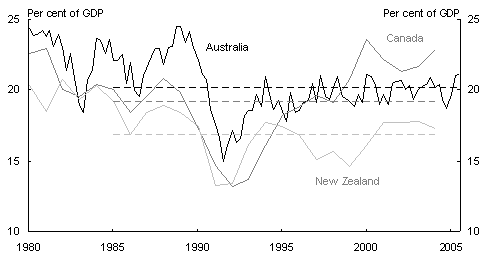
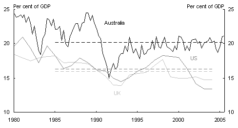
Let me begin with a comparison of national saving rates, before turning to investment rates later in my talk. Chart 4 (a and b) shows gross national saving rates since 1980 in the four Anglophone comparator countries, along with past two-decade averages in each case. Australia is included in both panels of the Chart for ease of comparison.
Several interesting features emerge from this comparison.
Chart 4a: Gross national saving
Note: Dotted lines show averages since 1985.
Source: ABS, Treasury, IMF, Statistics New Zealand and New Zealand Treasury.
Chart 4b: Gross national saving
Note: Dotted lines show averages since 1985.
Source: ABS, Treasury and IMF.
On average over the past two decades, Australia has had higher gross national saving, as a share of GDP, than all four of these comparator countries. Furthermore, over the most recent few years, Australia’s national saving rate has been close to its two-decade average. For the comparator countries, the national saving rate in recent years has been higher than its two-decade average in Canada, about the same in New Zealand, lower in the United Kingdom, and much lower in the United States.
Interestingly, this pattern of recent national saving rates relative to their two-decade averages fits neatly with the pattern of government budget balances in these five Anglophone countries.
There has been no recent fall in the national saving rate relative to its two-decade average only in those countries that have significantly strengthened their budget positions in recent years (relative to their two-decade averages). Recent budget positions have been significantly strengthened in Australia and New Zealand, where recent national saving rates have been maintained at around their two-decade averages, and in Canada where the recent national saving rate is significantly higher than its two-decade average.
By contrast, the recent national saving rate has been lower than its two-decade average in those countries with recent budget balances roughly the same or weaker than their two-decade averages. This has been the case in the United Kingdom and the United States.9
In Australia’s case, the significant strengthening in the budget balance for the combined levels of government is shown in Chart 5. For the combined levels of government, the Australian budget balance has averaged 2percent of GDP higher over the past three years than its average over the two decades from 1985-86.
Chart 5: Australian budget balance
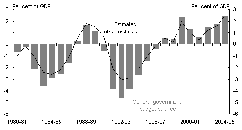
Note: The bars show the general government underlying cash budget balance for all levels of government sourced from the Australian Treasury, and the line an estimate of the structural balance derived using OECD estimates of the cyclical budget contributions.
The level of national saving in Australia in recent years has also been supported by the compulsory Superannuation Guarantee levy, although it is not straightforward to quantify its effect on national saving. After allowing for a significant reduction in other private-sector saving in response to the compulsory levy, Gallagher (1997) estimates a contribution to national saving of 2percent of GDP currently, which is projected to rise to 3per of GDP by 2020. These estimated numbers suggest that the compulsory levy is contributing significantly to national saving, and will continue to do so.
Returning to the five Anglophone countries as a group, the general trends in national saving and budget balances across these countries are interesting and important for a couple of reasons.
Firstly, they suggest that consumers are only partly Ricardian. That is, when the government raises its level of savings, consumers (and/or firms) do not fully offset that rise in public savings with a decline in private savings. There is probably some partial private-sector offset, but it is far from complete — a proposition that I think by now commands broad support. A recent IMF study for industrial countries, for example, estimates that a rise in public saving of 1percent of GDP leads over time to an average percent of GDP rise in national saving.10
The second reason why the trends in national savings and budget balances are interesting is that they suggest that, absent the significant strengthening of budget positions in Australia, Canada and New Zealand, national saving rates would probably have fallen in all five of these Anglophone countries over the past two decades. That, in turn, suggests that there were other powerful influences which were acting to reduce private savings significantly in all these countries over this time.
What were these other influences?
I think the most obvious candidates, which are of course somewhat related, are financial deregulation and housing booms.
Financial deregulation has enabled people to borrow to fund consumption and/or purchase dwellings, which in many cases they could not have done without it. Financial deregulation would have had this effect even if there had been no accompanying housing booms. To the extent that it enabled private consumption to be higher, private saving was lower than would otherwise have been the case.
Before moving on, let me state clearly that my observation that financial deregulation has been a strong influence acting to reduce private saving does not mean that I think that financial deregulation was a mistake. Indeed, I think it has been a favourable development, notwithstanding some severe and costly mistakes, particularly in its early phases in the late 1980s and early
1990s when many banks demonstrated limited ability to manage the risks they were taking.
Turning to housing booms, there are clearly idiosyncratic factors in each country, including idiosyncratic differences in the generally favourable tax treatment of housing. But there are also important common factors across these Anglophone countries. These include the establishment and maturing of credible low-inflation regimes (which brought with them low nominal and real interest rates); the world-wide savings glut after the 1997 Asian financial crisis which drove down world real interest rates (Bernanke,2005, and Wolf, 2005); and financial deregulation.
Financial deregulation and the sometimes fierce financial-sector competition that goes with it has undoubtedly contributed to housing booms by making it easier for people to borrow against the equity in their houses, and by reducing the interest-rate margins at which they can undertake this borrowing. Rising house prices raise the wealth of many households, and relax borrowing constraints because of rising collateral values. Housing booms therefore contribute to stronger private consumption via these mechanisms and therefore to lower private saving than would otherwise be the case.
And indeed, housing booms have occurred over recent years in all the Anglophone countries, to varying degrees. From the beginning of 1997 to the present, house prices have risen by about 160percent in the UK, 120percent in Australia, 80percent in the United States and New Zealand and 60percent in Canada, compared with consumer price rises of around 20 to 30percent in these countries over this time.11
Although I think it is reasonable to argue that the combination of financial deregulation and housing booms has tended to reduce private and hence national saving, it is not easy to provide reliable quantitative estimates of this impact.
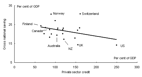
Much empirical work attempting to quantify the effects of financial deregulation uses the ratio of private credit to GDP as a proxy for the extent of financial sector deregulation — on the grounds that there is likely to be more financial intermediation, and hence a larger stock of outstanding private credit, in countries with more deregulated financial systems.
While this logic is impeccable, it is unfortunately also true that for a given extent of financial deregulation, the ratio of private credit to GDP rises strongly in housing booms, because the value of borrowing for the purchase of dwellings rises strongly as house prices rise. So this ratio of private credit to GDP does not provide a clean, unambiguous, measure of the extent of financial deregulation.
Nevertheless, having recognised its shortcomings, it is of at least some interest to show the relationship across the OECD between the ratio of private credit to GDP and the gross national saving rate. Chart6 shows this relationship using the latest available data. The results are at least consistent with the story I have been telling that a higher stock of private credit — associated with more deregulated financial systems and with housing booms — also tends to be associated with a lower rate of gross national saving.12
Chart 6: National saving and private credit
Source: World Bank
Of course, as we have seen, the tendency for national saving to be lower can be offset by introducing compulsory private saving schemes, as Australia has done, and by strengthening the government’s budget position, as has been done in Australia, New Zealand and Canada among the Anglophone countries.
Investment
Let me turn now to a comparison of gross national investment rates across the five Anglophone countries that we have been examining.
Before doing so, recall that our focus is on the current account deficit, which is the excess of national nominal investment over national saving. Hence, we are interested in the ratio of nominal investment to nominal GDP, rather than the ratio in real terms.13
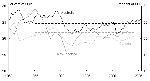
Chart 7 (a and b) shows the ratios to GDP of gross national nominal investment in the five Anglophone countries over the past quarter-century. Australia is again included in both panels of the Chart for ease of comparison.
Chart 7a: Gross national investment
Notes: Ratios use current price data. Dotted lines show averages since 1985.
Source: ABS, Treasury, IMF, Statistics New Zealand and New Zealand Treasury.
On average over the past two decades, gross national investment in Australia has been a higher share of GDP than in any of the four comparator Anglophone countries. And the differences are quite large. Over the past two decades, national investment in Australia has averaged 2percent of GDP above that in New Zealand, 4percent of GDP above that in Canada, 5percent of GDP above that in the United States and 6percent of GDP above that in the United Kingdom.
Compared to these four comparator Anglophone countries, Australia’s sizeable current account deficits over the past two decades can be understood as a consequence of Australia having invested a significantly higher share of national output than these other countries, rather than having saved less. Had the Australian national saving rate remained as it was over the past two decades, but with national investment running at the rates experienced by these comparator countries, the Australian current account deficit would have been several percentage points of GDP lower than it was over this time.
Chart 7b: Gross national investment
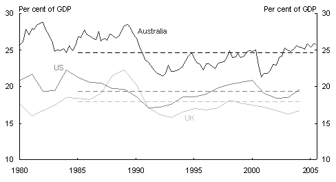
Notes: Ratios use current price data. Dotted lines show averages since 1985.
Source: ABS, Treasury and IMF.
It is also of interest to disaggregate Australian gross national investment into its component parts, something that has been done in the next two Charts.
Chart 8 shows public and business investment as shares of GDP over the same time period as the earlier Charts. About three-quarters of public investment is undertaken by State and local governments, with the rest undertaken by the Federal government. As the Chart shows, public investment as a share of GDP declined steadily from the mid 1980s to the late 1990s, before levelling out, with part of the decline explained by privatisation of public enterprises.
Chart 8: Business and public investment
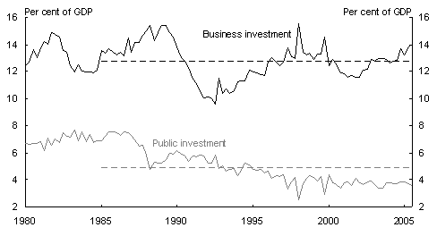
Notes: Ratios use current price data. Dotted lines show averages since 1985.
Source: ABS and Treasury.
Turning to business investment, although the real quantity of business investment has been rising strongly over recent years, nominal expenditure on business investment has been rising more slowly because the price of business-investment goods has been declining. As shown in Chart 8, nominal business investment is currently running a little above its two-decade average as a share of GDP, having recovered strongly through the mid1990s from the deep trough into which it sank in the early 1990s recession.
The final category of investment is dwelling investment. Chart 9 shows the ratio of dwelling investment including ownership transfer costs to GDP in both nomin
al and real terms. The nominal share of national output devoted to dwelling investment (including ownership transfer costs) has recently been running almost 2percent of GDP higher than its two-decade average, although it has declined over the past year or so with the waning of the housing boom.14
Chart 9: Dwelling investment (including ownership transfer costs)
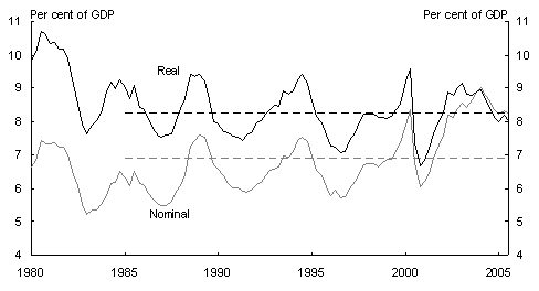
Note: Dotted lines show averages since 1985.
Source: ABS and Treasury.
Interestingly — and of surprise to me at least — the nominal share of national output devoted to dwelling investment (including ownership transfer costs) has been rising gradually in Australia for over four decades, from 5.1percent in the 1960s, to 6.1percent in the 1970s, to 6.4percent in the 1980s, and to 6.5percent in the 1990s. The housing boom led to a significant acceleration of this trend, so that the share thus far in the 2000s has been 7.9percent of GDP.
It has therefore been a long-established pattern that Australians in aggregate have spent a rising nominal share of their incomes on dwelling investment as community living standards have risen. But this has been partly a consequence of a gradually rising relative price of dwelling investment. In real terms, the ratio of dwelling investment to national output shows no clear upward trend, as Chart 9 shows. As previously explained, it is the ratio in nominal terms that is of relevance for the current account deficit.
Interestingly, this Australian pattern of spending a gradually rising nominal share of national output on dwelling investment as community living standards rise does not appear to apply to a cross-section of developed countries more generally. Chart 10 shows a scatter plot for OECD countries in 2004 of the nominal share of national output devoted to dwellings verses their standard of living (GDP per capita measured at PPP exchange rates).15
Chart 10: Dwelling investment and GDP per capita
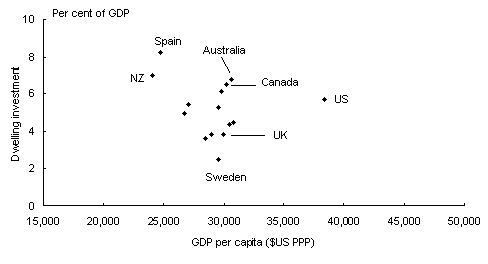
Note: Dwelling investment to GDP ratios use current price data.
Source: OECD, Groningen Growth and Development Centre and Treasury.
While a scatter plot is no substitute for a rigorous scientific test, there is no obvious tendency in these data for richer countries to spend a higher nominal share of their national output on dwelling investment.
Perhaps there really is something special about Australians’ attachment to their homes— something which is apparently not replicated more broadly across the developed world.
There is a further observation worth making at this point. While Australia has spent a significantly higher nominal share of its national output on dwellings in recent years than it did previously, two of the four Anglophone comparator countries that we have been examining, Canada and New Zealand, have recently been spending about the same share as Australia (Chart10). Australia’s nominal spending on dwelling investment looks high when compared with its own past, but not so high when compared with comparable countries that have also experienced significant housing booms.
Looking to the future, the prospects for dwelling investment in Australia depend importantly on the prospects for house prices. House prices in Australia in aggregate, after rising strongly for many years, have remained roughly flat since the beginning of 2004. Given the extent of the rise in house prices in earlier years, it seems likely that we will continue to see little if any aggregate growth in house prices in Australia for quite some time yet.
Given these likely prospects for house prices, an interesting question is whether the nominal share of national output devoted to dwelling investment (including ownership transfer costs) is likely to decline over time, back closer to the levels experienced in the 1980s and 1990s of around 6percent of GDP. There are no signs in the current data of this process occurring quickly, but it could occur gradually over the next several years.
As the housing boom continues to wane, it also seems likely that household saving rates will rise somewhat, as the mechanisms described earlier by which the housing boom led to stronger consumption and less household saving gradually begin to reverse. We may be seeing the first signs of a rise in household saving in the September Quarter 2005 National Accounts.
Of course, prospects for the current account deficit depend not only on developments in the household sector, but also on the other components of national saving and investment.
On business investment, the September quarter 2005 CAPEX survey from the ABS implies nominal business investment in 2005-06 about 13percent higher than in 2004-05, including a projected rise in nominal mining investment of over 20percent (assuming five-year average realisation ratios). If this outcome is realised, it will imply nominal business investment in the current financial year about to of apercent of GDP higher than in 2004-05.
Thus, while developments in the household sector have contributed significantly to the Australian current account deficit over recent years, it seems likely that they will make less of a contribution over the next several years, while the business sector and the mining sector in particular will make a larger contribution.
Concluding remarks
Over the past two decades of sizeable Australian current account deficits, the ratio of net foreign liabilities to GDP has been rising gradually but steadily (Chart 2). There is no compelling reason why this ratio cannot continue to rise gradually for quite some time to come, provided Australia retains the confidence of international capital markets. But it cannot continue to rise forever.
Were the ratio of net foreign liabilities to GDP to stabilise around current levels, this would require a current account deficit sustained at around 3percent of GDP, rather than the 4percent of GDP that it has averaged over the past two decades. This involves a narrowing in the gap between national investment and national saving of the same magnitude. It also requires a sustained trade surplus of something like to percent of GDP.16
As we have seen in Chart 1, Australia has run trade surpluses for only brief periods over the past quarter-century. To sustain trade surpluses around to percent of GDP will therefore involve a significant adjustment for the economy, although it is an adjustment that can occur gradually over an extended period of time.
In response to Australia’s sizeable current account deficits over the past two decades, Federal governments of both political persuasions have responded both with a compulsory private-saving scheme and with sustained fiscal restraint. As I have argued in this talk, these efforts have significantly raised the Australian national saving rate above the levels that would otherwise have prevailed.
With every prospect that Australia will continue to see sizeable current account deficits for some years to come, the argument for continued fiscal restraint remains a compelling one.
On this point, it is worth recalling that the government has committed itself in the 2005-06Budget to a gradual and continuing medium-term tightening of fiscal policy.
The fiscal strategy remains budget balance on average over the cycle, but the relevant budget aggregates now ‘raise the bar’ for budget balance by excluding the earnings from Future Fund assets. Quarantining these earni
ngs therefore represents a gradual and continuing tightening of fiscal policy over the medium term. Depending on the size of subsequent contributions to the Fund, this tightening could be of the order of to percent of GDP within a few years.
But should the government be doing more?
In answering this question, I think it is illuminating to compare the economic circumstances facing the United States and Australia at present. The two countries are currently running current account deficits that are roughly the same shares of their respective national incomes.
As we have seen earlier, gross national saving is running at about 14percent of GDP in the United States and about 20percent of GDP in Australia. A significant part of this difference is accounted for by the different budget stances in the two countries, with the US Federal government running budget deficits of around 3percent of GDP, while the Australian Federal government is running budget surpluses of about 1percent of GDP or more. Also of relevance, the stock of US general government net debt is currently about 45percent of US GDP, while for Australia the comparable figure is close to zero and projected to turn significantly negative soon.
Given the situation in which the US finds itself, it is unsurprising that the overwhelming policy advice being offered to the US Federal government is to rein in its budget deficit significantly. This advice is offered not only because of the size of the US current account deficit but also because, quite apart from the current account, running continual significant budget deficits after several years of above-trend growth is not good public policy.
In Australia’s case, however, it is far from clear that public policy should do more to raise national saving than it is currently doing. Both the compulsory Superannuation Guarantee Levy and the gradual tightening of fiscal policy implicit in the current fiscal strategy imply that the government is already partially offsetting the aggregate national implications of private sector savings and investment decisions.
Should fiscal policy be systematically tighter than is currently envisaged? It is not clear to me that it should. Australia’s fiscal position is one of the strongest in the world, and is projected to strengthen further over time with growth in the stock of assets in the Future Fund.
None of this is to say that Australia’s current account deficits should be treated with benign neglect. The impressive performance of the Australian macroeconomy since climbing out of the early 1990s recession has been possible because Australia has maintained the confidence of international capital markets over this time, with the result that Australians have been able to borrow internationally on favourable terms.
And with Australia continuing to draw on foreign savings to fund part of its national investment, it remains important for public policy to be crafted with an eye to retaining this confidence. And that means a continued focus on sensible coherent public policies.
References
Australian Treasury, ‘Australian net private wealth’, Economic Roundup Summer 2004-05, pp85-98.
Bernanke, B (2005), ‘The global saving glut and the U.S. current account deficit’, 10March www.federalreserve.gov.
De Mello, L, Kongsrud, P and Price, R (2004), ‘Saving behaviour and the effectiveness of fiscal policy’, OECD Economics Department Working Paper No. 397, July.
Edey, M and Gower, L (2000), ‘National savings: trends and policy’, The Australian Economy in the 1990s, Reserve Bank of Australia, pp277-311.
Gale, W and Orszag, P (2004), ‘Budget deficits, national savings and interest rates’, Brookings Papers on Economic Activity: 2, Brookings Institution, pp101-210.
Gallagher, P (1997), ‘assessing the national saving effects of the government’s superannuation policies: some examples of the new RIMGROUP national saving methodology’, Conference Paper 97/3, The Fifth Colloquium of Superannuation Researchers, University of Melbourne.
Gruen, D and Sayegh, A (2005), ‘The evolution of fiscal policy in Australia’, Australian Treasury Working Paper 2005-04, November.
IMF (2005), ‘Chapter II: Global imbalances: a saving and investment perspective’, World Economic Outlook, September, pp91-124.
Wolf, M (2005), ‘Will Asian mercantilism meet its waterloo?’, Richard Snape Lecture, 14November, Productivity Commission, Melbourne.
1 I am grateful to Lan Lu for enthusiastic assistance in putting this talk together, and to StevenKennedy, Paul O’Mara and Martin Parkinson for helpful comments and suggestions. The views expressed are those of the author and not necessarily those of the Australian Treasury.
2 This average, and the data in Chart 1, excludes gold transactions by the Reserve Bank of Australia.
3 A further item, net current transfers, also contributes to the current account, but is very small in general.
4 The wealth stock used for Chart 2 is the Treasury measure of Australian nominal private-sector wealth at market value from ‘Australian net private wealth’, Economic Roundup, Summer 2004-05. It is primarily made up of dwelling and business assets, and includes Australian investment abroad and excludes foreign liabilities. The current issue of the Economic Roundup contains an updated private-wealth series.
5 Looking to the future, the value of dwelling assets will likely rise much more gradually over the coming decade than it did over the most recent one. This follows because the main determinants of the big rise in dwelling wealth over the past decade — the decline in nominal and real borrowing rates that accompanied the establishment of the low-inflation regime in the early 1990s, combined with financial deregulation — can occur only once.
6 In a model economy growing in the steady-state, the two measures of foreign liabilities would evolve in the same way because, in such a steady state, GDP and private-sector wealth would grow at the same rate. But what is true in steady state need not be true in the transition to a new steady state, like the transition in Australia to low inflation and a deregulated financial system.
7 It is possible to inflation-adjust the national savings rate, but this adjustment makes only a small difference (see Figure 5 in Edey and Gower, 2000).
8 There are small differences in the National Accounts between the current account deficit and the excess of national investment over national saving. These differences need not concern us here.
9 The Canadian budget balance over the latest three years, 2003-2005, has averaged 4percent of GDP stronger than its average over the two decades, 1986-2005. The corresponding figure for New Zealand is 3percent of GDP. For the UK, the average over the latest three years is 1percent of GDP weaker than the two-decade average, while for the US it is 1percent of GDP weaker. (These numbers are derived from OECD estimates of government financial balances, including latest estimates for 2005). The corresponding Australian figure for the combined levels of government is 2percent of GDP stronger, as reported in the text.
10 See Chapter II, World Economic Outlook, September 2005, IMF. De Mello, Kongsrud and Price(2004) find a Ricardian offset for 21
OECD countries ranging from ⅓ to , and Gale and Orszag(2004) find a similar result for the United States.
11 The data series used for these estimates are the Halifax house price index for existing homes for the UK, the ABS house price index for Australia, the house price index from the Office of Federal Housing Enterprise Oversight for the US, the Quotable Value House Price Index for New Zealand and the Bank of Canada’s Resale-housing prices for Canada.
12 The relationship is mildly statistically significant, with a t-statistic on the private-credit-to-GDP variable of 1.6. More importantly, this variable becomes more statistically significant in a more richly specified multivariate analysis of gross savings across the OECD which allows for many other influences on savings (See Table 2.2, Chapter II, World Economic Outlook, September 2005, IMF).
13 This distinction between nominal and real ratios is of lesser importance when examining trends in public investment. But it is quite important when examining trends in either business or dwelling investment. The price of business investment relative to the GDP deflator has declined continuously through time (a trend that has accelerated with the proliferation of ICT investment goods), while the relative price of dwelling investment has risen.
14 The sharp rise and subsequent fall in dwelling investment in 2000 were associated with the introduction of the GST.
15 The numbers shown for Australia in Charts 9 and 10 are not the same because ownership transfer costs are not included in Chart 10.
16 These numbers depend on the level at which net foreign liabilities to GDP is stabilised, the growth rate of the economy, and the average rate of return on the stock of net foreign liabilities. The Appendix in Gruen and Sayegh (2005) provides further details.