Xavier Sala-i-Martin and Sanket Mohapatra1
In the 2001 centenary edition of the Economic Roundup, Treasury presented the evidence then available of narrowing in the last decades of the 20th century of inter-country inequality, and continuing reduction in the proportion of the world population in extreme poverty.2 Subsequent research - such as that presented below - has used new ways of presenting available (albeit still imperfect) data. It supports stronger claims than in the centenary Roundup. The absolute number in poverty has begun to fall, notwithstanding global population growth, for the first time in the history of the statistics. Moreover we can now picture how narrowing inter-country inequality has outweighed widening national inequality in some countries, so that global inequality has apparently begun to narrow.
Most estimates of poverty and inequality use only household surveys of income or expenditure. These estimates have been criticised for not accounting for the role of public spending in influencing poverty and inequality, and because for many countries, surveyed household income or expenditure have been falling below estimates of similar concepts from national accounts by an increasing margin over time. Professor Xavier Sala-i-Martin of Columbia University published several influential studies in 2002 that addressed these problems by combining survey estimates of distribution with national accounts estimates of consumption or income levels.3
During 2001 and 2002, the Group of Twenty (G20)4 large economies compared their experiences of the policy challenges from globalisation, including their experiences of poverty and inequality. Treasury asked Professor Sala-i-Martin to apply his methodology to illustrating poverty and inequality trends in the G20 economies. The resultant paper, co-authored with Sanket Mohapatra and reprinted below, was distributed to Finance Ministers and Central Bank Governors at their meeting in November last year.5 While it draws upon earlier published work, its database has been widened to include estimates for all G20 member economies except Saudi Arabia (for which no data was available). National data limitations also mean estimates for South Africa and Argentina are of lower quality than for the other economies.
While the paper's data and methodology mean its results are not directly comparable with World Bank numbers, it estimates that extreme poverty in the G20 fell from 380 million people in 1970 to 40 million by 1998, and that the Gini coefficient of inequality across the population of the G20 fell by about 8 per cent.
Introduction
Over recent years, the G20 grouping of systemically important economies has examined, by case studies among its member economies and a workshop, how the trends of globalisation may be affecting living standards, poverty and inequality. The objective has been to better understand the advantages, problems and policy challenges arising from globalisation.
Sala-i-Martin (2002) has developed a methodology to combine the best quality information on income and distributional levels and trends for the widest number of countries. This approach yields clear pictures of how national income distributions have changed over the last 30 years, to produce changing patterns of intra-country distributions, inter-country distributions, and global distributions of income.
This paper uses that methodology and some approximate extensions of the available data, to explore these same trends among the G20 economies as a group, and between the G20 and the broader world. Such an approach may be helpful in illustrating the broad trends in income, poverty, and inequality among a small but diverse group of important economies, whose ranks include both rich and poor countries, and countries that have recently experienced economic crises as well as strong economic growth.
Methodology
We briefly describe the methodology developed by Sala-i-Martin (2002) and how we apply it to estimate the individual country distributions of the G20 group. We also construct an aggregate distribution for the entire group and use it to compute poverty rates and headcounts as well as various inequality indexes.
Step 1: Estimating yearly income shares between 1970 and 1998
We use the income shares estimated by Deininger and Squire, which have been extended with the World Development Indicators (WDI) of the World Bank.6 These studies report income shares for five quintiles for a number of countries for selected years based on national-level income and expenditure surveys. Let s(ikt) be the income share for quintile k, for country i during year t. Using these data we have three broad groups of countries:
- Group A: Those for which the income shares are reported for more than one year. The G20 countries in this group are Australia, Brazil, Canada, China, France, Germany, India, Indonesia, Italy, Japan, Republic of Korea, Mexico, Russian Federation, Turkey, United Kingdom, and the United States.
- Group B: Those for which we have only one observation between 1970 and 1998. The only G20 country in this group is South Africa.
- Group C: Those for which we have NO observations of income shares. The only G20 country that belongs to group C is Argentina.
For the countries in group A, we plot the income shares over time and we observe that they tend to follow very smooth trends.7 In other words, although the income shares estimated by Deininger and Squire and the World Bank are not constant, they do not seem to experience large movements in short periods of time. Instead, they seem to have smooth time trends.8 Using this information, we regress income shares on time to get a linear trend for each country. We use the projected income shares from these regressions to fill the holes for the missing years.
For the countries in group B, we take the single estimate of the shares for the year in which these are available. We then project back and forth for other years using the average slopes of the 'neighbouring countries' for which we have data. We define 'neighbouring countries' as those that belong to the same 'region' as defined by the World Bank. In particular, since the only G20 that belongs to group B is South Africa, we use the single point estimate of the income shares for South Africa and we use the time slopes estimated for the rest of 'African Countries'.
For the countries in group C (for which, remember, we have no data on income shares), we use the average income shares of the neighbouring countries. Since the only G20 country in this group is Argentina, this means that we use the average income shares for all Latin American countries as proxies for Argentina's.
Step 2: Estimating country histograms
Once we have estimated the income shares, s(ijk), we assign a preliminary level of income to each fifth of the population using Purchasing Power Parity (PPP)-adjusted per capita GDP from the Summers-Heston data (Summers and Heston (1999), and Heston, Summers and Aten (2001)).9 We divide each country's population in five groups and assign to them a different level of income. In this intermediate step, each individual is assumed to have the same level of income within each quintile. In other words, we construct country-specific histograms for each year and for each country.
Step 3: Estimating each country's income distribution.
We next estimate a kern
el density function for each country and each year using the five quintiles estimated in the previous section. The key parameter that needs to specified or assumed is the bandwidth of the kernel. The convention in the literature suggests a bandwidth of w=0.9*sd*(n-1/5), where sd is the standard deviation of (log) income and n is the number of observations. Obviously, each country has a different standard deviation so, if we use this formula for w, we would have to assume a different w for each country and year. Instead, we prefer to assume the same bandwidth w for all countries and periods. One reason is that, with a constant bandwidth it is very easy to visualise whether the variance of the distribution has increased or decreased over time. Given a bandwidth, the density function will have the regular hump (normal) shape when the variance of the distribution is small. As the variance increases, the kernel density function starts displaying peaks and valleys. Hence, a country with a distribution that looks 'normal' is a country with small inequalities, and a country with a weird distribution (with many peaks and valleys) is a country with large income inequalities.
The average sd for the United States between 1970 and 1998 is close to 0.9, the average Chinese sd is 0.6 (although it has increased substantially over time) and the average Indian sd is 0.5. For many European countries the average sd is close to 0.6. We settle on sd=0.6, which means that the bandwidth we use to estimate the Gaussian kernel density function is 0.35. We evaluate the density function at 100 different points so that each country's distribution is decomposed into 100 centiles.
Once the kernel density function is estimated, we normalise it (so the total area under it equals to one) and we multiply by the population to get the number of people associated with each of the 100 income 'categories' for each year. In a way, what we do is to estimate the incomes of a 100 centiles for each country and each year between 1970 and 1998.
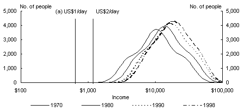
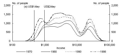
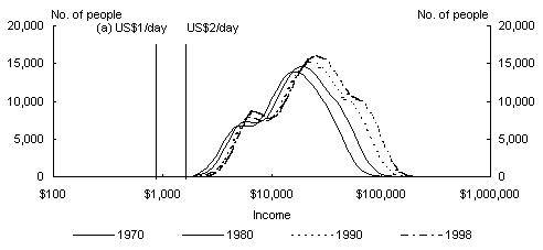
Charts 1 to 18 display the results for the 18 countries (there are 19 countries in the G20 group, but the Summers-Heston data set does not report any GDP data for Saudi Arabia, so we exclude this country from our analysis). The figures also plot two vertical lines, which correspond to the World Bank's official poverty lines: the one-dollar-a-day (US$1/day) line and the two-dollar-a-day (US$2/day) line.10 Since the World Bank defines 'absolute poverty' in 1985 values and the Summers and Heston data that we are using are reported in 1996 dollars, the annual incomes that define the US$1/day and US$2/day poverty in our data set are US$532 and US$1 064 respectively.
As an example, let us focus our attention on the Chinese distribution (see Chart 5). The distribution for 1970 is hump-shaped with a mode US$898. About one-third of the function lies to the left of the US$1/day poverty line (which means that about one-third of the Chinese citizens in 1970 lived in absolute poverty) and close to three-quarters of the distribution lies to the left of the US$2/day line. We see that the whole density function 'shifts' to the right over time, which reflects the fact that Chinese incomes are growing. The incomes of the richest Chinese increases substantially (the upper tail of the distribution shifts rightwards significantly). The incomes of the poor also experience significant improvements. By 1998, the distribution has a mode at US$2 000 and it appears that a local maximum starts to arise at US$4 900. The fraction of the distribution below the one-dollar line is now less than 3 per cent and the fraction below the two-dollar line is less than one-fifth. An interesting feature to notice is that the distribution seems to be more 'dispersed' in 1998 than it was in 1970 or 1980. This reflects the well-documented increase in income inequality within China. In sum, over the last twenty years, the incomes of the Chinese have grown, poverty rates have been reduced dramatically and income inequalities within the most populous nation in the world have increased.
Charts 1 to 18 display the evolution of the distribution functions for each of the G20 countries over time (excluding Saudi Arabia). It is interesting to point out that for countries like Australia, Canada, France, Germany, Japan, Mexico and Turkey, the bottom 20 per cent of the population seems to lag behind in 1970. By 1998, this segment of the population seems to have caught up with the rest of the distribution. That is, for these countries, the 'hole' between the bottom quintile and the rest of the population seems to have 'filled up' over the last 30 years.
Step 4: Integrating over countries to construct the G20 income distribution
We have now assigned a level of income to each individual in a country for every year between 1970 and 1998. We can use these individual income numbers to estimate a Gaussian kernel density function that proxies for the world distribution of individual income.
Previous researchers have used kernel densities to estimate world income distributions. For example, Quah (1996, 1997), Jones (1997), and Kremer, Onatski and Stock (2001) estimate it by assuming that each country is one data point (and the concept of income is per capita GDP). Instead, we use the individual incomes estimated in the previous section. Thus, our unit of analysis is not a country but a person.
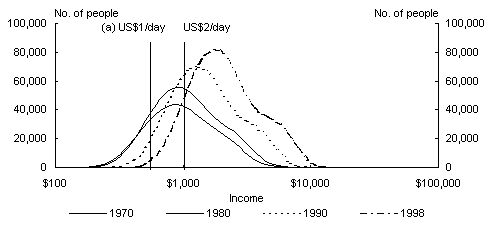
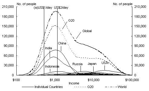
Charts 19 to 22 report the estimates of the density functions for 1970, 1980, 1990 and 1998.11 To see how the G20 distribution is constructed from the individual country functions, we also plot the distributions for the individual countries in the G20 in the same graph. Finally, the same figure reports the World Income Distribution as estimated by Sala-i-Martin (2002).
Analysis of the distribution of income for G20 countries
We start our analysis with Chart 19, which displays our 1970 estimates. Since we have computed it so that the area under the distribution is proportional to the country's population, the 'tallest' distribution corresponds to China, followed by India and the United States. These individual distributions correspond exactly to the ones reported in Charts 1 to 18. In the earlier figure, each panel reported a single country for various years whereas now we report all the countries together for a single year.
The world distribution of income is the aggregate of all the individual country density functions. The G20 distribution is the aggregate of all countries in the G20. We notice that the World Distribution and the G20 Distribution are quite similar. The reason is that the G20 account for 63 per cent of the world's population. The modes of both the G20 and the World distributions in 1970 occur at US$900, below the two-dollar poverty line. About one half of the area under the G20 distribution lies to the left of the two-dollar line and almost one fifth-lays below the one-dollar line. The fraction of the G20 and world population living in poverty in 1970 was, therefore, staggering.12 The distribution seems to have a local maximum at US$8 700, which mainly captures the larger levels of income of the United States, Japan, and Europe. Russia seems to be somewhere in between.
The picture for 1980 (Chart 20) is very similar to that of 1970. The maximum is slightly higher at US$1 022, still very close to the two-dollar line, and the local maximum of the rich is now at US$10 100 which suggest that the world was slightly richer in 1980 than in 1970, but the picture looks basically identical.
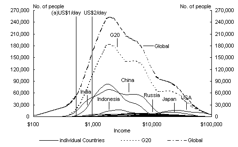
Things start changing in the 1980s and 1990s (Charts 21 and 22 correspond to 1990 and 1998 respectively). The distributions for 1970 and 1980 look very similar, but the whole density function for 1990 has moved appreciably to the righ
t, and more so by 1998.13 We notice that as China, India, and Indonesia start growing (their individual distributions shift to the right), the lower part of the world distribution (which contains most of the people in the 1970s and 1980s) also shifts rightward. Within countries, we see that, while the Indian distribution retains the same shape, the Chinese density function becomes flatter and more dispersed. This reflects the fact that Indian inequality has not increased as dramatically over this period as China's. The fraction of the G20 distribution of income to the left of the two poverty lines declines dramatically. By 1998, less than one-fifth lies below the two-dollar line (down from over 43 per cent in 1970) and around 1 per cent lies below the one-dollar line (down from 16 per cent in 1970).The G20, therefore, has had an unambiguous success in the war against poverty rates during the last three decades.14
Charts 23 and 24 put the G20 distributions for the four years in the same graph. This allows us to see its evolution more easily. We see that the distribution is shifting to the right on average, which means that the average citizen of the G20 is richer or that the mean growth rates have been positive. We also see that the top of the distribution also shifts to the right, which means that the 'rich get richer'. It is interesting to see that the bottom of the G20 distribution appears to shift even more to the right so that 'the poor also get richer', but whether the poor have in fact gained relatively more than the rich is a question to which we return with some summary quantitative measures below.
Finally, the middle of the distribution experiences substantial improvement: what used to an 'empty area' around US$9 000 is now filled up by the top of the Chinese, Indian and Russian distributions. In fact, the G20 distribution for 1998 exhibits three local modes: one at US$1 950, one at US$5 400 and the last one at US$19 000.
Poverty rates and headcounts
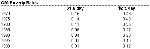
Once the income distributions have been estimated, we can compute the fraction of the overall population that earns incomes below particular levels. In particular, one can estimate the fraction of G20 population that earns incomes below the US$1/day that is defined to be the 'absolute poverty line' or the US$2/day line, which is usually called the 'poverty line'. Chart 25 and Table 1 reports the estimates of these two poverty rates for the G20. We see that the fraction of the G20 population with income below US$1/day has fallen from 15 per cent to 1 per cent. The fraction below US2$/day has fallen from 43 per cent to 12 per cent.
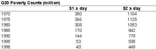
The total amount of people with income levels below the poverty lines have also declined dramatically: the number of G20 citizens living with incomes below US$2/day has declined from 1.1 billion in 1970 to 450 million in 1998. The number of people with less than one dollar a day has decreased from 380 million to 40 million in 1998.15 Chart 26 and Table 1 report the absolute numbers in poverty corresponding to the estimated poverty rates of Chart 25.
Our estimates of the poverty rates are substantially lower than those reported by the World Bank (see for example, Ravallion and Chen (1997)). There are two reasons for these discrepancies. First, we compute the fraction of the population that earns incomes below US$1/day whereas the World Bank tends to report consumption. Although it is not clear that consumption estimates are better (for example, consumption does not take into account the public spending that substitutes for private consumption expenditures such as schooling, hospitals, roads or other public services), Sala-i-Martin (2002) checks the potential size of this bias. He uses the methodology used in the present paper to estimate 'consumption' poverty rates and he shows that the rates would triple. Thus, the consumption poverty adjustment for G20 for change the 1990 rates from 4 per cent to 12 per cent and the 1998 rates would increase from 1 per cent to 3 per cent (and the overall number of poor would increase from 40 million to 120 million).
A second important difference between our estimates and those of the World Bank is that we scale individual income shares by GDP or Consumption as reported by the National Accounts, whereas the World Bank adjusts by the average consumption reported by the surveys. It is well known that surveys tend to underestimate true consumption since people tend to under-report their consumption (or income). Bhalla (2002) estimates that the ratio of the mean consumption of the surveys to National Account consumption is as low as 0.73. If we divide our estimated poverty rates by 0.73 we would find that our consumption poverty rates for US$1/day would be 4.11 per cent or 164 million people. With the adjustments, the US$2/day poverty rate in 1998 would be 49 per cent or 1.8 billion.
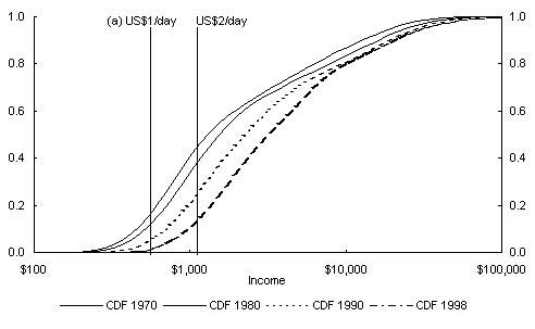
For those readers who want to compare poverty lines, Chart 24 reports the Cumulative Distributive Functions (CDF) corresponding to the distributions in Chart 23. The CDF is useful because the image tells us the fraction of the distribution that lies below any given point. Thus, the reader can pick a poverty line and the image of that line on the CDF illustrates the fraction of the population living below that particular line. Notice that, no matter what poverty line one chooses to pick, the poverty rates in G20 have been falling dramatically.
Income inequality among individuals in the G20
The next step is to use the distributions to analyse the evolution of various inequality measures (see Cowell, 1995, or Sala-i-Martin, 2002, for the exact formulae used in computing the indexes). The inequality indexes provide a quantitative measure of the dispersion of individual incomes in the G20 countries.
Chart 27 shows the estimate of the popular Gini coefficient for the G20 countries. We find that the income inequality measured by the Gini coefficient has declined by around 8 per cent between 1970 and 1998. The across-country Gini, which assumes that all individuals in a country have the same per capita income and therefore does not take into account within-country differences in incomes, follows a very similar pattern to the overall Gini, though the decline in the across-country Gini is distinctly larger during the 1990s.
Three other 'non-decomposable' measures of income inequality are shown in Charts 28 to 30.16 The variance of logarithmic incomes (or varlog) in the G20 shows a small increase during the 1970s, but decreases substantially in the next two decades by over 22 per cent. A similar but more marked downward trend is observed for the across-country component in the 1980s and 1990s. The two Atkinson indices A(0.5) and A(1), with a coefficient of inequality aversion of 0.5 and 1 respectively, also confirm the declines in overall dispersion and across-country dispersion of individual incomes during the last two decades.
The G20 'global' inequality measures demonstrate that large gains have been made in reducing income disparities across people in the G20 group of countries, particularly in the 1980s and 1990s. When we compare the G20 'global' and across-country inequality measures, the reductions in across-country dispersion seem to follow a very similar trend to the G20 global measures, but the decline is greater in magnitude during the 1980s and 1990s. This has been largely due to the high growth rates achieved by the two most populous members of the G20 - China and India - relative to the other G20 member countries following economic reforms and financial liberalisation measures. While PPP-adjusted per capita inc
ome grew at an annual average of 6 per cent in China and by 3.9 per cent in India between 1980 and 1998, the mean annual income in the rest of the G20 member countries (excluding Saudi Arabia) grew at only 1.7 per cent per annum.
In order to precisely measure the relative contribution of across-country and within-country components in the decline in income dispersion across individuals the G20 countries, we use 'decomposable' inequality indices. Inequality indices belonging to the Generalized Entropy Index (GEI) class are decomposable into across-country and within-country components.
Three popular GEI inequality indices are shown in Charts 31 to 33. In addition to the 'global' and across-country dispersion of individual incomes, there is now a third curve representing the within-country component of the aggregate dispersion (the sum of the within and across components adds up to the overall dispersion). The three decomposable measures are the Mean Logarithmic Deviation (or GEI(0)); the Theil Index (or GEI(1)); and the Coefficient of Variation (CV) Square (or GEI(2)). All three measures appear to follow very similar trends between 1970 and 1998.
Our first finding on examining the within and across-country components of the three decomposable indices is that the within-country component is a relatively small fraction of the total dispersion. For the Mean Logarithmic Deviation (MLD), only 19 per cent of the G20 differences in incomes could be explained by within country inequalities in 1970. The share of within country component rose over time, but was still only 35 per cent in 1998. The corresponding fractions for the Theil Index were 24 per cent and 32 per cent. The bulk of the dispersion of individual incomes in the G20 group is therefore explained by the across-country component.
The second finding is that the pattern of evolution of the overall dispersion and the across-country component look very similar, though there has been a larger decline in the across-country component in the 1990s. While the overall MLD decreased by over 14 per cent in the 1990s, the across-country component of G20 inequality declined by 25 per cent in the same period.
The third interesting finding is that the slight increase in the within country component during this period was not large enough to offset the effect of a reduction in the across-country component. All three GEI indices declined during the sample period - the MLD by 21 per cent, the Theil Index by 15 per cent and the CV Square by 8 per cent. The reduction in the overall dispersion of individual incomes in the G20 group in the last two decades was therefore achieved primarily due to across-country convergence in aggregate per capita incomes among the G20 countries.
It is worth noting that the slight increase in the within country component is 'on average'. Some G20 members appeared to have experienced narrowing intra-country inequality. While there is considerable variation in the evolution of the income distribution across the G20 member countries, it appears that Indonesia and Korea (from the developing countries in the G20), and Germany and France (among the developed members of the G20), have had narrowing inequality between 1970 to 1998.
The important lesson we draw from the analysis of the inequality indices is that income disparities across the citizens of the G20 group have declined primarily due to increase in aggregate growth rates in the populous countries of the G20 group. This decline in income disparities among the G20 member countries has taken place during a period where several important and populous developing countries in the G20 have implemented economic and financial liberalisation measures, welcomed trade and foreign investment, and have integrated further into the global economy.
Conclusions
The G20 members have enjoyed enormous progress against poverty, especially over the last 20 years. That is true even though some members have experienced setbacks from economic crises over that time.
The income distribution diagrams show that it is possible to have much less poverty with some widening (on average) in intra-country inequality. While overall inequality in the G20 (and the world) has come down, on average narrowing inter-country inequality has dominated slightly widening intra-country inequality to produce narrower inequality in the G20 as a group. But that is on average, not all members have experienced widening intra-country inequality, and some that have, had started from unusually narrow distributions (for example, China and Russia under central planning
and state ownership of the means of production). This suggests that starting points, national circumstances and national policies are still powerful influences on inequality.
These complex patterns of changes show us that we should think twice about simplistic characterisations of global economic change 'making the rich, richer, and the poor, poorer'. In fact, the poor in the G20 (and the broader world) have been getting richer in unprecedented numbers, and are beginning slowly to reduce the relative gap with the rich. We need to think more carefully about absolute poverty, relative poverty, inter-country inequality and intra-country inequality. What do we really care about most, and why? What can we change, and how?
The success of the G20 economies has been remarkable, but success does not mean victory. The number of poor is still embarrassingly large: in 1998, about 450 million people still had an income of less than US$2 dollars per day. And even if the G20 economies are succeeding, the world at large is losing an important battle: the battle of Africa. In the 1970s, poverty was essentially an Asian phenomenon. It is now mainly an African problem. And, while the most powerful nations of the world can be happy about their performance and their success, they cannot be entirely happy with the state of the planet. The lessons learned in the G20 countries need to be applied to Africa. And they need to be applied fast.
Chart 1: Income Distribution - Argentina
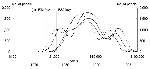
Chart 2: Income Distribution - Australia
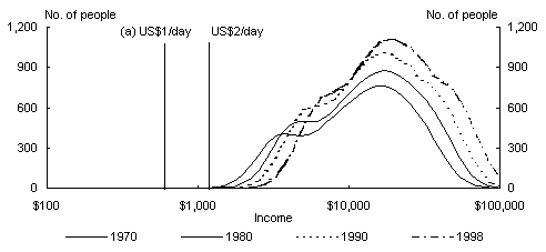
Chart 3: Income Distribution - Brazil
(a) Equivalent in 1996 prices to US$1 or US$2 a day income poverty line in 1985 prices.
Chart 4: Income Distribution - Canada
Chart 5: Income Distribution - China
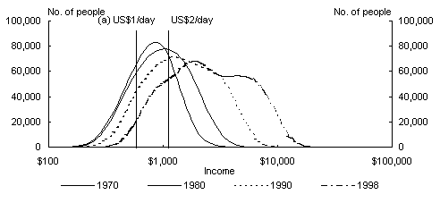
Chart 6: Income Distribution - France
(a) Equivalent in 1996 prices to US$1 or US$2 a day income poverty line in 1985 prices.
Chart 7: Income Distribution - Germany
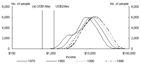
Chart 8: Income Distribution - Indonesia
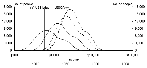
Chart 9: Income Distribution - India
(a) Equivalent in 1996 prices to US$1 or US$2 a day income poverty line in 1985 prices.
Chart 10: Income Distribution - Italy
Chart 11: Income Distribution - Japan
Chart 12: Income Distribution - Korea, Republic
(a) Equivalent in 1996 prices to US$1 or US$2 a day income poverty line in 1985 prices.
Chart 13: Income Distribution - Mexico
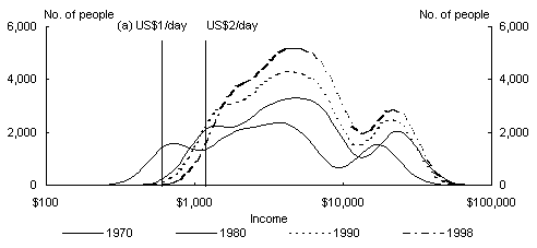
Chart 14: Income Distribution - Russian Federation
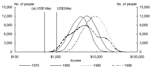
Chart 15: Income Distribution - South Africa
(a) Equivalent in 1996 prices to US$1 or US$2 a day income poverty line in 1985 prices.
Chart 16: Income Distribution - Turkey
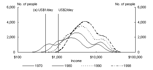
Chart 17: Income Distribution - UK
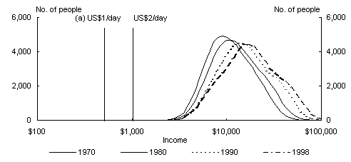
Chart 18: Income Distribution - USA
(a) Equivalent in 1996 prices to US$1 or US$2 a day income poverty line in 1985 prices.
Chart 19: G20 and Global Distributions - 1970
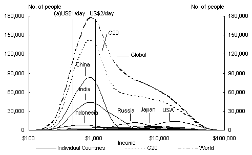
Chart 20: G20 and Global Distributions - 1980
(a) Equivalent in 1996 prices to US$1 or US$2 a day income poverty line in 1985 prices.
Chart 21: G20 and Global Distributions - 1990
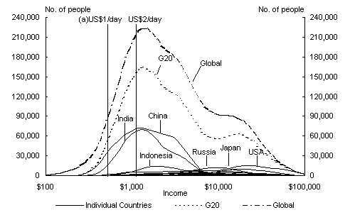
Chart 22: G20 and Global Distributions - 1998
(a) Equivalent in 1996 prices to US$1 or US$2 a day income poverty line in 1985 prices.
Chart 23: Evolution of G20 Income Distribution
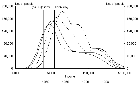
Chart 24: Evolution of G20 Income Distribution (CDF)
(a) Equivalent in 1996 prices to US$1 or US$2 a day income poverty line in 1985 prices.
Chart 25: Poverty rates - G20 Countries
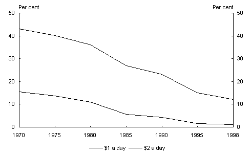
Chart 26: Poverty headcounts - G20 countries
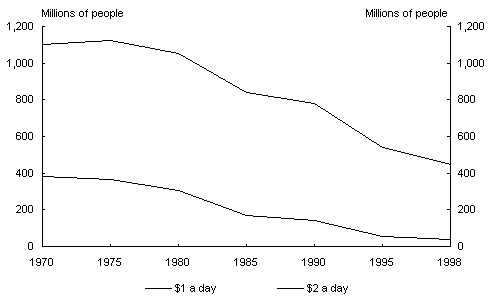
Chart 27: G20 Income Inequality - Gini Coefficient
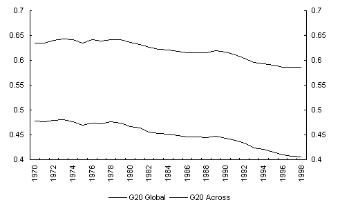
Chart 28: Variance of Log Income for G20
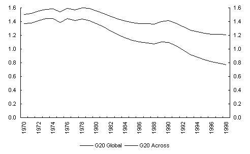
Chart 29: G20 Income Inequality - Atkinson (0.5)
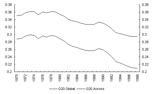
Chart 30: G20 Income Inequality - Atkinson (1)
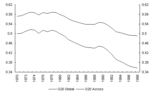
Chart 31: Inequality Decomposition for G20 -
MLD (or GEI (0))
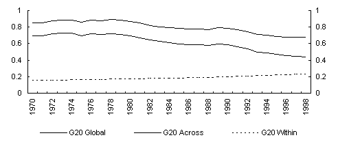
Chart 32: Inequality Decomposition for G20 -
Theil Index (or GEI (1))
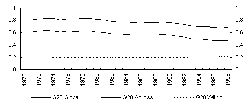
Chart 33: Inequality Decomposition for G20 -
CV Square (or GEI (2))
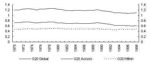
Table 1: Poverty in the G20 (per cent)
Bibliography
Atkinson A. B. and A. Brandolini, (2001), 'Promise and Pitfalls in the use of 'Secondary' Data-Sets: Income Inequality in OECD Countries as a Case Study', Journal of Economic Literature, vol XXXIX, number 3, pp.771-800, September.
Bhalla, S., Imagine There's No Country: Poverty, Inequality and Growth in the Era of Globalization , Institute of International Economics, Washington, DC.
Cowell, F.A., (1995), Measuring Income Inequality, 2nd Edition, Harvester Wheatsheaf, Hemel Hempstead.
Deininger, K. and L. Squire, (1996), 'A New Data Set Measuring Income Inequality', World Bank Economic Review, Vol. 10, pp. 565-91.
Heston, A. R. Summers, and B. Aten, (2001), Penn World Table Version 6.0, Center for International Comparisons at the University of Pennsylvania (CICUP), December.
Sala-i-Martin, X (2002), 'The World Distribution of Income', NBER Working Paper 8933, May.
Su
mmers, Robert and Heston, Alan., (1991), 'The Penn World Table (Mark 5): an expanded set of international comparisons, 1950-1988', Quarterly Journal of Economics, 106(2), May, 327-68.
Ravallion, M. and S. Chen, (1997), 'What Can New Survey Data Tell Us About Recent Changes in Distribution and Poverty?' World Bank Economic Review 11: 57-82.
Ravallion, M., Datt, G., and van de Walle, D. (1991), 'Qualifying Absolute Poverty in the Developing World', Review of Income and Wealth, 37, 345-361.
- The views expressed in this article are those of the authors and are not necessarily those of the Commonwealth Treasury.
- 'Global poverty and inequality in the 20th century: turning the corner?' Economic Roundup, May 2001 pp. 1-52.
- Sala-i-Martin, X.: April 2002, The disturbing 'rise' of global income inequality, Working Paper 8904, National Bureau of Economic Research; and May 2002, The world distribution of income (estimated from individual country distributions), Working Paper 8933, National Bureau of Economic Research. Other researchers have since used similar approaches. See: Bourguignon, F. & Morrisson, C., September 2002, 'Inequality Among World Citizens: 1820 - 1992', American Economic Review, Vol 92 No 4, pp. 727 - 744. Bhalla, S.S. 2002, Imagine There's No Country: Poverty, Inequality and Growth in the Era of Globalization, Institute for International Economics, Washington DC, available at
- The G20 was established in 1999 to provide an informal mechanism for dialogue among systemically important countries within the framework of the Bretton Woods institutional system. Member countries include: Argentina, Australia, Brazil, Canada, China, France, Germany, India, Indonesia, Italy, Japan, México, Russia, Saudi Arabia, South Africa, Korea, Turkey, the United Kingdom, the United States and the European Union. The Managing Director of the IMF and the President of the World Bank, as well as the Chairpersons of the International Monetary and Financial Committee and Development Committee of the IMF and World Bank, participate fully in the discussions.
- The paper was first published in November 2002 as Discussion Paper #0203-10 in the Discussion Paper Series of Columbia University's Department of Economics.
- The data can be found in http://www.undp.org/povert/initiatives/wider/wiid.htm
- Discussion Paper #0203-10 in the Discussion Paper Series of Columbia University's Department of Economics illustrates this process in diagrams, not reproduced here, for China, India, the US and Indonesia.
- Obviously, these trends can only be temporary since income shares are bounded between 0 and 1.
- Saudi Arabia, despite being important enough to be a member of the G20, is excluded from our analysis due to unavailability of both PPP-adjusted per capita GDP and data on income shares. Therefore, we have 18 of the 19 countries in the G20 in our sample.
- Ravallion et al. (1991) define poverty in terms of consumption rather than income.
- As mentioned earlier, the bandwidth used is 0.35.
- While the poverty estimates for 1970 are indeed staggering, they are of an order of magnitude consistent with other estimates, as demonstrated in Sala-i-Martin (2002).
- The policy interest in this is, of course, what happened around the late 1970s or early 1980s to make things change? One partial answer is Chinese reforms: first agricultural and then trade (see for example David Dollar, p12 in the RBA/Treasury Conference Volume
http://www.rba.gov.au/PublicationsAndResearch/Conferences/2002/index.html)
Another more general answer is that many populous developing countries (not just China and then India) started to take advantage of the rapid growth in global trade in manufactures:
http://publications.worldbank.org/ecommerce/catalog/product?item_id=370788 - Progress against poverty in the G20 actually accelerated through the 1980s and 1990s. It is interesting to note that the upsurge in 'anti-globalization' protests in recent years actually coincided with faster progress against poverty and an accelerating decline in inter-country and global inequality.
- The fall in poverty numbers from 1970 to 1998 were notwithstanding a growth in G20 population of 1 277 million over that period, mostly in the poorer countries. China, India and Indonesia together contributed 939 million, or 74 per cent, of the total increase.
- Non-decomposable means that the overall inequality cannot be decomposed as a sum of across-country and within-country components. The Gini coefficient, variance of log incomes (VarLog) and the Atkinson class of indices belong to this class of measures.