Downloads
Introduction1
Thank you for the opportunity to speak to you today.
At the risk of sounding like a cracked record, let me say that we are living in interesting times. The increasingly worrying developments in the Euro-area are one aspect of this, but so is the once-in-a-lifetime boom in the terms of trade we are currently experiencing in Australia.
I want to do two main things in my speech today. The first is to provide an update on some analysis I did just over five years ago in early 2006, which compared the macroeconomic outcomes in the current terms of trade boom with those in the terms of trade boom of the 1970s.
The second thing I want to do is explain some work we have been doing in Treasury examining the implications of the terms of trade boom for output growth in the mining and non-mining sectors of the economy, and for the distribution of unemployment across the country.
A tale of two terms of trade booms
In early 2006, I gave a speech entitled A Tale of Two Terms of Trade Booms in which I contrasted the current terms of trade boom with the terms of trade boom of the early 1970s.
At the time I, along with many other people, expected that the rise in the terms of trade we were experiencing was going to be of a roughly similar size to the terms of trade boom of the 1970s.
That forecast turned out to be ... well, let's just say 'wide of the mark' (Chart 1).
Chart 1: Terms of Trade
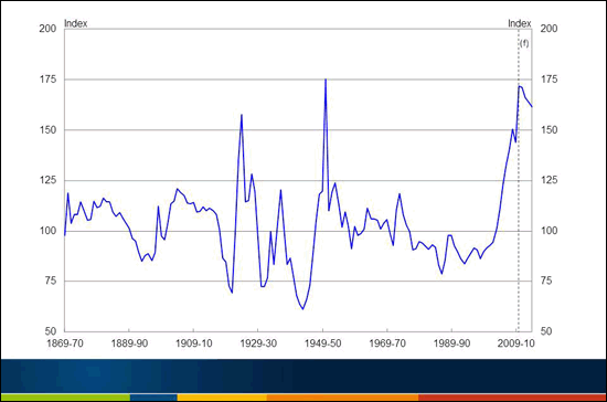
Note: The 2011-12 Budget forecasts are used for the assumed future evolution of the terms of trade.
Source: ABS Cat. No. 5206.0 and Treasury.
The terms of trade are now almost 50 per cent higher than they were when I gave that speech. They reached their highest level in at least 140 years in the June quarter 2011, surpassing the 1950-51 peak associated with the huge spike in wool prices during the Korean War.2
Prices of our bulk commodity exports rose further in the September quarter 2011 (in both foreign currency and Australian dollar terms) and have since eased. Therefore, while we don't yet know whether the September quarter is the global peak, it is at least a local peak. Most forecasters, including us, see the terms of trade easing from here as growth in global supply starts to catch up to, and then outpace, growth in global demand.
Given how big this terms of trade boom is turning out to be, and how disruptive for other parts of the traded sector of the economy, it is of interest to revisit the earlier comparison of the response of the macroeconomy to the current terms of trade boom and to the boom in the 1970s.
As is widely understood, the current terms of trade boom is largely a consequence of big rises in the prices Australia receives for many of its mineral commodity exports. What is less frequently commented upon, but is also a feature of the boom, is the significant rise in the price of a range of rural commodities.
Since the beginning of 2003, when the terms of trade started to rise strongly, the RBA's non-rural commodity price index in SDRs has risen by about 315 per cent, while the rural index has risen by nearly 65 per cent.
Both these developments owe a lot to rising demand from China and, to an increasing extent, India and Indonesia, as they continue their process of development, urbanisation, and strong growth of their middle classes, with rising disposable incomes to match.
The terms of trade boom of the 1970s was also driven by rising commodity prices - but in that case, the commodities were predominantly rural.3
As I did in my 2006 speech, I will compare the 1970s boom with the current one across a range of dimensions. As before, the analysis of the 1970s boom begins in the June quarter 1970, and the current one in the June quarter 2002. Using these starting points allows the analysis to begin a year or so before the relevant commodity prices start to gather strength. And by using the latest published forecasts, from the 2011-12 Budget, we can extend the current episode out to the June quarter 2013, enabling the period of analysis to run for 11 years for both booms.
For simplicity, the initial quarters, the June quarter 1970 and the June quarter 2002, are labelled 'quarter 0', with subsequent quarters labelled 1, 2, 3 etc.4
Chart 2 is then the first chart comparing outcomes in the two booms. It shows the evolution of the terms of trade, which, for the first few years, was broadly similar in the two booms. From about quarter 15 onwards, however, the terms of trade profiles diverge; with the 1970s boom subsiding, while the current one continued to build, at least until it was derailed temporarily by the global financial crisis.
Chart 2: Terms of Trade
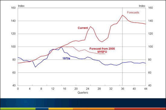
Note: Quarter 0 is June 1970 for the '1970s', and June 2002 for 'Current'. The lines are both indexed to '100' in quarter 15. The 2011-12 Budget forecasts are used for the assumed future evolution of the terms of trade.
Source: ABS Cat. No. 5206.0 and Treasury.
Relative to the 1970s, the two striking things about the current boom are its size and duration. The terms of trade are currently almost 50 per cent above the peak reached in the 1970s, and the current boom has already lasted about four times as long.5
The size and duration of the current boom has two obvious implications. Firstly, it implies that the relevant sector - in this case mining - has time to put in place huge quantities of capital investment to respond to the boom in prices. And secondly, the duration of the current boom, and the sustained high level of the exchange rate, has implications for the viability of the business models of some firms in other parts of the traded sector, which we will come to shortly.
Chart 3 shows the nominal trade weighted exchange rate (TWI) over the same time periods as for the terms of trade.
Chart 3: Nominal value of the $A (TWI)
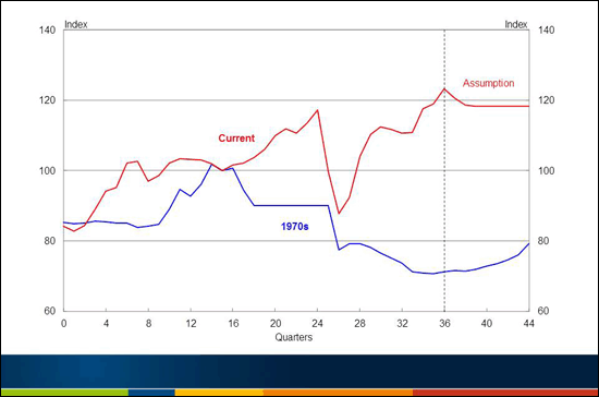
Note: Quarter 0 is June 1970 and June 2002. The lines are both indexed to '100' in quarter 15.
Source: RBA and Treasury.
In the 1970s, the terms of trade had already risen quite a lot before there was any rise in the nominal exchange rate. And, of course, the lack of movement of the exchange rate had everything to do with the exchange rate regime in place at the time.
With a fixed exchange rate regime, the government had to take an explicit decision to appreciate the exchange rate - thereby harming the profitability of some easily indentified, and vocal, industries. The difficulty of taking this explicit decision is well illustrated by the experience of the early 1970s, when there was virtually no appreciation in the trade-weighted exchange rate until December 1972, quarter '10' in our nomenclature.6
By that time, the newly elected Federal Labor government had accepted the strong economic case for appreciating the exchange rate but, aware of its unpopularity, timed its announcement for the Saturday two days before Christmas, confident that most people had other things on their minds at that time.7
Unfortunately, t
he economic impetus provided by the strongly rising terms of trade, without any offset from the exchange rate, was very destabilising for the macroeconomy, as we will see.
In the current episode, by contrast, the exchange rate was rising strongly before there had been much of a rise in the terms of trade, presumably because markets were anticipating that the gathering strength of the world economy as it recovered from the early 2000s recession would sooner or later generate significant rises in the terms of trade of raw-material exporting countries like Australia. As events turned out, that expectation turned out to be broadly correct - even though the importance of sustained Chinese growth for the Australian terms of trade was not appreciated until later.
Since the June quarter 2002 (quarter 0 for the current boom), Australia's nominal trade-weighted exchange rate has appreciated by about 45 per cent, and has been above its post-float average for 30 of the past 38 quarters. As everyone is aware, what we are dealing with now is not a short-lived appreciation, but a sustained shift. And, of course, this difference has important implications for the response of the trade-exposed sectors.
After almost 30 years of a floating exchange rate, Australian businesses are well equipped to deal with short-term exchange rate volatility. However, the extended period of the high exchange rate has seen a growing number of businesses in the trade-exposed manufacturing and services sectors re-evaluating their business models, and in some cases exiting the industry.
The next variable I want to focus on in our comparison of the two terms of trade booms is real growth in the non-farm economy, shown in Chart 4.
Focusing on the non-farm economy allows us to abstract from the effect of drought, which can have a significant influence on aggregate GDP and mask the underlying forces acting on the rest of the economy (particularly in the 1970s when the agricultural sector accounted for a much larger share of the economy than it does today).8
Chart 4: Growth in non-farm GDP
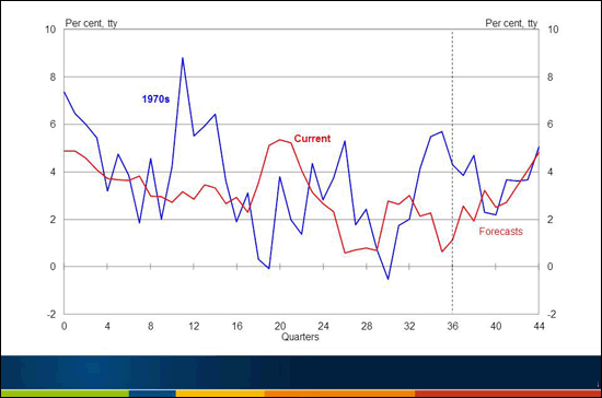
Note: Quarter 0 is June 1970 and June 2002.
Source: ABS Cat. No. 5206.0 and Treasury.
In the 1970s, the strongly rising terms of trade, combined with the absence of any restraint imposed by the exchange rate until December 1972, generated a sizeable economic boom.
Non-farm GDP grew by an astonishing 8.8 per cent over the year to the March quarter 1973, at a time when the economy was already operating at close to full capacity. Non-farm GDP growth then turned briefly negative on two occasions following the 1970s terms of trade peak - in 1975 and again in 1977.
As Chart 4 shows, economic growth has been much less volatile this time around, with a standard deviation of non-farm GDP growth in the current episode only a little more than half that during the 1970s one.
The lower volatility of economic growth this time around is all the more impressive given the much bigger, and more sustained, current terms of trade shock, as well as the unwelcome arrival of the global financial crisis in the middle of it.
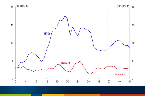
The next two charts complement each other and show the strikingly different inflationary consequences of the two booms. Chart 5 shows growth in consumer prices and Chart 6 growth in male average earnings.
Chart 5: Consumer Prices
Note: Quarter 0 is June 1970 and June 2002.
Source: ABS Cat. No. 6401.0 and Treasury.
Chart 6: Male Average Weekly Earnings
(total earnings, all employees)
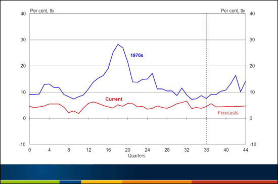
Note: Quarter 0 is June 1970 and June 2002. Male average weekly earnings for all employees are used because they are the only easily available wage data going back before the 1970s terms of trade boom.
Source: ABS Cat. No. 6302.0 and Treasury.
Consumer price inflation was already quite high at the beginning of the 1970s before the terms of trade started to rise sharply. And the same is true of growth in average earnings. But while these outcomes were unfavourable, they were merely the prelude to much more unfavourable outcomes, as the two charts show.
In the aftermath of the terms-of-trade induced economic boom, wages growth accelerated extremely sharply in 1974, fuelling a continuation of double-digit CPI inflation and generating a sharp rise in real wages, which cast a long shadow in the labour market as we will see shortly. Again, the contrast with inflation and wage outcomes in the current episode is a stark one.
As has been widely recognised, the centralised wage fixing system operating in the 1970s played a role in transmitting demand pressures in some sectors of the economy to wage outcomes across the whole economy. By contrast, the significantly more decentralised wage-setting arrangements currently in place have enabled wage outcomes to more closely match sectoral demand-supply balances, with fewer implications for growth in aggregate wages.9
The next comparative chart, Chart 7, shows Australian government payments (the cash equivalent of government expenditure) as a share of GDP over the financial years spanning the periods shown in the previous charts. In the earlier boom, government payments rose very sharply in the mid 1970s. This huge fiscal expansion was clearly unhelpful from a macroeconomic perspective; occurring as it did just as double-digit CPI inflation was becoming entrenched in the Australian economy.
Chart 7: Australian government general government payments
(deviations from year 1)
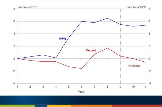
Note: Year 1 represents the financial year 1970-71 for the '1970s' and 2002-03 for 'Current'.
Source: Final Budget Outcome 2010-11 and 2011-12 Budget.
Again, the contrast with the current boom is striking. On this occasion, Australian government payments fell gradually as a share of GDP as the terms of trade gathered strength, until the arrival of the global financial crisis. At that point, there was a sizeable, and well-timed, counter-cyclical fiscal response to the powerful contractionary forces associated with crisis. As the crisis subsided, Australian government payments again began to fall as a share of GDP.10
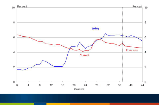
The final comparative chart, Chart 8, shows the unemployment rate for the two episodes. Unemployment was extremely low in the lead up to the 1970s terms of trade boom, as it had been for most of the previous two decades. With the sharp rise in real wages in 1974, however, unemployment also rose sharply. By late 1977, the unemployment rate had risen above 5½ per cent; a rate it would not fall back below until October 2004 (aside from a single month in 1981).
Chart 8: Unemployment Rate
Note: Quarter 0 is June 1970 and June 2002.
Source: ABS Cat. No. 6204.0 and Treasury.
While the mis-handling o
f the terms of trade boom of the early 1970s cannot be held responsible for the unemployment rate for the next thirty years, it probably can be held responsible, at least to some extent, for poor unemployment outcomes for most of the next decade.11
Decomposing output growth between mining and non-mining sectors
As mentioned earlier, another important difference between the two booms is the supply response.
The shorter duration of the boom and the natural limitations associated with a rapid expansion of agricultural production meant only a limited supply response was possible to the large spike in prices in the 1970s. Agricultural output is volatile from year to year, but even in the most productive year of the decade, 1978-79, agricultural output was less than 20 per cent above its pre-boom (1970-71) level.
This time around, the volume of Australia's coal production has increased by 25 per cent since 2003-04 and iron ore production has doubled, contributing to a 30 per cent increase in the volume of Australia's non-rural exports over the period. Furthermore, given the current pipeline of resources investment (dominated by the LNG sector), a much larger expansion in Australia's production of resource commodities is in store in coming years.
Chart 9: Mining and Non-Mining Investment
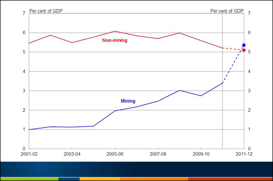
Note: Estimates for 2011-12 are based on long-run average realisation ratios.
Source: ABS Catalogue Numbers 5204.0, 5625.0 and Treasury.
Mining investment in Australia rose 30 per cent in 2010-11 with a further 70 per cent increase expected in 2011-12 (Chart 9). This represents a doubling of investment over two years, with the current $430 billion pipeline of resources investment suggesting further growth through to around the middle of the decade.
This investment, and the related increase in production, is drawing on a range of industries, from construction, to transport, to parts of the manufacturing sector, as well as to service providers such as lawyers and accountants. Thus, as well as producing output in its own right, the mining sector also uses inputs from a variety of other sectors to boost its production levels.
Treasury has recently done some work on the implied sectoral composition of the economic growth forecasts presented in the 2011-12 Budget to isolate the implied growth rates for the mining, mining-related and non-mining parts of the economy.
This has allowed us to gauge both how significant are the flow-on effects of increased mining production and investment to other parts of the economy, as well as how slow is growth in those parts of the economy that are not benefitting directly from the resources boom.
To do this analysis, we use the latest Input-Output tables, for 2007-08, to translate our expenditure-based estimates into production-based estimates.12 We decompose the economy into four broad sectors:
- Agriculture;
- Mining, which for the purposes of this analysis includes those components of the metals manufacturing industry that are included in the ABS definition of non-rural commodity exports;
- Mining-related, which includes those parts of the domestic manufacturing, construction and services industries that directly contribute to mining production and investment; and
- Non-mining, which is the part of the non-farm economy not directly benefitting from the resources boom.13
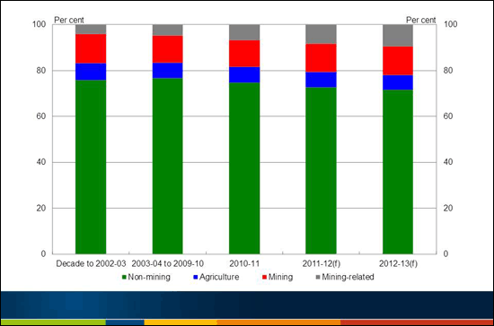
Chart 10: Sectoral shares
Source: ABS Cat. No. 5206.0 and Treasury.
The shares of the economy represented by these four broad sectors are shown in Chart 10. In the decade before the current terms of trade boom, the 'mining' sector, as defined here, accounted for 12.7 per cent of GDP. Counter intuitively, given the substantial increase in iron ore and coal production that I mentioned earlier, this share is expected to be broadly the same in 2011-12.
The really strong growth has instead been in mining-related production - that is, those parts of the domestic manufacturing, construction and services industries that directly contribute to mining production and investment. This sector has increased from 4 per cent of GDP in the decade before the mining boom to an expected 9 per cent in 2011-12.
Abstracting from agriculture, this leaves around 70 per cent of the economy (down from around 75 per cent in the decade to 2002-03) that is not expected to benefit directly from the resources boom.
Chart 11: Sectoral contributions to GDP growth
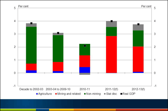
Note: Black squares show aggregate GDP growth.
Source: ABS Catalogue Numbers 5204.0, 5206.0 and Treasury.
Chart 11 shows the estimated contributions to real GDP growth from these four sectors.
The Budget forecasts the Australian economy to grow by 4 per cent in 2011-12 and 3¾ per cent in 2012-13. The mining and mining-related sectors, which together account for around 20 per cent of the economy currently, were expected to contribute more than two-thirds of this real GDP growth in 2011-12, while the 70 per cent of the economy not directly benefitting from the resources boom was expected to contribute less than a third.
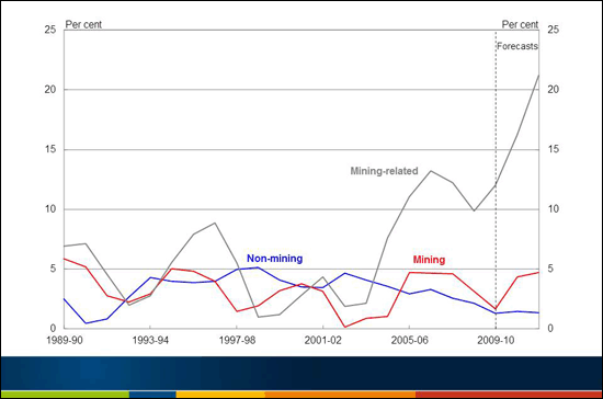
Chart 12: Sectoral growth rates
(three year centred moving average)
Source: ABS Cat. No. 5206.0 and Treasury.
Looking alternatively at implied sectoral growth rates, the Budget forecasts imply average annual growth of nearly 5 per cent in mining output, as defined here, over the three years 2010-11 to 2012-13, but over 20 per cent in mining-related output, driven by the forecast strength in mining-related construction.
By contrast, the Budget forecasts imply average annual growth of around 1 per cent for those parts of the non-farm economy not benefiting directly from the resources boom over the same three years. Therefore, while the 2011-12 Budget forecasts imply quite good aggregate real GDP growth, around 70 per cent of the economy is expected to grow at around 1 per cent.
This is a direct consequence of the factors I described earlier, including the impact of the high exchange rate on the competitiveness of trade-exposed industries, as well as the lingering effects of the financial crisis, including changing patterns of expenditure by consumers and the continuing difficulty some businesses have in accessing finance.
Of course, even this 1 per cent growth rate for the non-farm non-mining economy masks significant divergences, with some service sectors growing and generating significant increases in employment (for example, employment in health care and social assistance grew by 6.2 per cent in 2010-11) while other sectors (for example retail and wholesale trade, and manufacturing) remain under considerable pressure.
To leave the analysis here, however, would be to tell only part of the story. There is a complementary way to look at the economy's response to these differential growth rates across the mining and non-mining sectors, which is to look at the behaviour of the labour market and, in particula
r, the distribution of unemployment rates across the country.
Data on unemployment rates are available for about 1,400 statistical local areas (SLAs) which, together, span the whole of Australia. We can therefore examine how the distribution of unemployment across the country has changed over time. Chart 13 shows, for every quarter from Sep 1998 to Jun 2011, two summary measures of this distribution - the average unemployment rate, and its dispersion (the weighted standard deviation across all SLAs).
Chart 13: Distribution of unemployment across the country
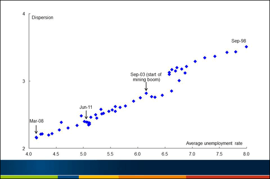
Note: Each point on the scatter plot shows the weighted average and weighted standard deviation of unemployment across statistical local areas for a particular quarter from Sep-1998 to Jun-2011. The weighted average unemployment rates for all SLAs differ slightly from those estimated in ABS 6202.0.
Source: DEEWR Small Area Labour Market database and Treasury.
As the mining boom has progressed, the average unemployment rate has fallen, and its dispersion across the country has also fallen. While it is possible to identify individual parts of the country that have experienced higher unemployment as a consequence of the differential rates of growth of the sectors of the economy (for example, the region around Cairns), the results in Chart 13 imply that these examples are the exception, rather than the rule.
We are seeing a widening gap between the growth rates of the mining (and mining-rated) sectors and the non-farm non-mining sector. But thus far the economy has absorbed this significant structural change with average unemployment remaining quite close to its full-employment rate, and the dispersion of unemployment across the country having declined to well below its level before the boom.
That is a quite impressive achievement.
Concluding remarks
Comparing macroeconomic outcomes in the current terms of trade boom with those in the 1970s provides a clear illustration of a simple proposition.
If a sizeable boom is being generated in one part of the economy, significant restraint needs to be imposed on other parts to ensure that the economy overall does not overheat.
The Federal Governments of the 1970s were in direct control of all arms of macroeconomic policy, including the value of the exchange rate. When commodity prices were rising strongly, generating boom conditions in parts of the economy, it proved extremely difficult for governments of either political persuasion to impose sufficient restraint on other parts to deliver an appropriate outcome for the economy overall.
By contrast, the current macroeconomic framework has several elements that together represent a crucial improvement on the framework of the 1970s. These elements are: a market-determined exchange rate, a medium-term inflation target implemented by the Reserve Bank, a medium-term fiscal framework implemented by the Federal Government, and largely decentralised wage-setting arrangements.
A consequence of the current framework is that when commodity prices are high, the floating exchange rate is likely to have appreciated sharply, acting as a shock absorber, and reducing the expansionary effects of the terms of trade rise on the overall economy. As a consequence, there is a smaller role for 'activist' macroeconomic management - simply because much of the necessary restraint is imposed by the exchange rate.
The exchange rate plays its shock-absorber role primarily by imposing significant restraint on those parts of the traded sector, including parts of the manufacturing sector, which are not experiencing strongly rising prices for their output or are not directly exposed to the booming sectors of the economy.14
But, as is widely understood, the predominant reason why this sustained restraint is being imposed on the Australian traded sector is because of the re-emergence of the Asian giants, China and India, into the global economy.
Asia has for some decades been the region of the world enjoying the fastest rates of economic growth and this seems likely to continue for some considerable time to come. As well as currently generating huge and growing demand for energy and mineral commodities, this rapid economic growth is also delivering millions of people into burgeoning middle classes, in China, India and elsewhere in Asia.
In the longer term, the increasing numbers of people in the Asian middle classes, with disposable incomes to match, will generate rising demand for a range of Australian goods and services - whether they be a range of foodstuffs, Australian tourist destinations, or educational, financial and other professional services in which Australia has a proven track record. Indeed, this process is well underway.
It would be brave to venture a prediction about which Australian economic sectors ultimately will benefit most from the re-emergence of China and India into the global economy. That is an argument for maintaining, and enhancing where possible, the flexibility of the Australian economy.
But, whichever Australian economic sectors ultimately benefit most from the re-emergence of China and India, this global changing of the guard seems more like a generational change in Australia's comparative advantage than it does an example of 'Dutch disease', in which we might wish to reverse much of the structural change currently occurring in the trade-exposed sectors of the economy, with the aim of returning Australia to something like its pre-boom industrial structure once a short-lived disturbance has passed.
As we have seen, the 1970s terms of trade boom ended badly - with a big rise in inflation, an economic bust during which growth in non-farm GDP briefly turned negative, as well as adverse longer-term implications for unemployment.
This time around, the economic outcomes during the terms of trade boom have been starkly different. Inflation outcomes have remained moderate and, notwithstanding some booming sectors and regions, boom conditions in the aggregate economy are notable for their absence. Aggregate unemployment has remained close to its full-employment rate, and its dispersion across the country has fallen.
Having avoided the aggregate boom during the current terms of trade upswing, as well as its inflationary consequences, there are grounds for optimism that Australia can also avoid a subsequent bust. When the terms of trade fall at some time in the future, there will be adverse implications for some sectors of the economy. But the macroeconomic framework currently in place enhances the prospects that an end to the terms of trade boom need not derail the aggregate economy - for the same reasons that the terms of trade upswing did not do so.
The current macroeconomic framework represents a crucial improvement on that in place in the 1970s. It has helped mute the business cycle. It cannot, however, deliver us a bullet-proof economy. Sufficiently large shocks, or macroeconomic policy mistakes, can still occur and can still generate severe macroeconomic difficulties - as the experience of the major advanced economies over the past several years amply demonstrates.
Two decades of good macroeconomic outcomes without a recession is an impressive achievement. But it should not tempt us to embrace the dubious notion that the business cycle has been consigned to the dustbin of history.
Additional Chart
Chart 14: Gross national saving and investment
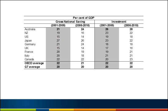
Note: Average over the specified period. Australian data are on the new Syst
em of National Accounts (SNA) 2008 basis, while other data uses the SNA93 and therefore may not be fully comparable due to changes in savings and investment measurement methodologies, although the differences appear small. New Zealand data are only to 2009.
Source: IMF World Economic Outlook, September 2011.
References
David Gruen (2006), 'A Tale Of Two Terms-Of-Trade Booms', Address to Australian Industry Group, Economy 2006 Forum, Melbourne, 1 March 2006.
Hughes, Barry (1980), 'Exit Full Employment', Angus and Robertson.
Economic Surveys (1972, 1974), 'Australia', Organisation for Economic Co-operation and Development.
Walsh, Maximilian (1972), 'Now for a Mini-Budget', Australian Financial Review, December 27, p.1.
1 Address to the Australian Business Economists Annual Conference. I am grateful to Simon Duggan and Hien Tran for help putting this speech together and to James Kelly and Steve Morling for helpful comments.
2 Of course, this compares the level in a single quarter with the average level over a financial year, before quarterly data were available. For the June quarter 2011, Chart 1 shows the 2011-12 Budget forecasts rather than the outcome; it is the outcome that exceeds the 1950-51 peak.
3 For example, over the year to September 1973, the Australian dollar price of wool rose by about 60 per cent, cereals and meat by about 40 per cent, and dried and canned fruits by 35 per cent (OECD 1974, p.11).
4 In the 2006 speech, these quarters were both numbered '-15' because 'quarter 0' was at the time the presumed peak of the terms of trade. Relabelling these quarters both 'quarter 0' seems simplest for present purposes; it has the benefit of retaining the alignment of the two booms chosen in the earlier talk.
5 In the 1970s, it took nine quarters from trough to peak in the terms of trade while, in the current episode, it has already been 32 quarters since the terms of trade started to rise strongly in the September quarter 2003.
6 There was intense public discussion of foreign exchange policy in Australia in late 1971. Export and import-competing industries - rural, mining and manufacturing - urged devaluation against the US dollar while a group of academic economists urged substantial appreciation. The Federal government decided on an appreciation of the Australian dollar against the US dollar, but it was so small that the currency fell slightly in trade-weighted terms (OECD 1972, pp.52-55)!
7 The appreciation on 23 December 1972, by 7.05 per cent, was decided by three senior ministers rather than the whole Cabinet - another sign of how difficult it was for governments to make such decisions (Maximilian Walsh, Australian Financial Review, 27 December, 1972, p.1). There were subsequent appreciations in February and September 1973, as well as a 25 per cent across-the-board tariff cut in July 1973, which were all designed to reduce the strong stimulus to the domestic economy being provided by the external sector (Barry Hughes 1980, pp. 62-64).
8 A focus on the non-farm economy remains informative even though the terms of trade boom in the 1970s was predominantly in agricultural commodities. Over the years we are examining, drought affected farm production in 1969-70, 1970-71, and in 2002-06.
9 A further source of inflationary pressure in the early 1970s was the first OPEC oil price shock, which arrived in the March quarter 1974, resulting in a near quadrupling in the Australian dollar price of oil in that quarter.
10 Some features of Australian government payments in the current episode are not revealed by this chart. Government payments grew at an average annual real rate of 3.7 per cent over the five years before the financial crisis, 2002-03 to 2007-08, but fell as a share of GDP over this time because nominal GDP was rising so strongly as a consequence of the rapidly rising terms of trade. In the crisis years, 2008-09 and 2009-10, government payments grew at an average annual real rate of 8.4 per cent, while over the subsequent three years, 2010-11 to 2012-13, they are forecast in the 2011-12 Budget to grow at an average annual real rate of 0.4 per cent.
11 The level of real unit labour costs in the economy, having risen sharply in 1974, did not return to its pre-terms-of-trade boom levels until the second half of the 1980s.
12 The Input-Output tables are produced as part of the National Accounts and provide a detailed mapping between the supply and use of products in the Australian economy across 111 product and industry groups.
13 The analysis is conducted using basic prices. To make the industry shares add to real GDP, we have also to account for taxes and subsidies and the statistical discrepancy between the expenditure and production measures of GDP. The Input-Output tables allow us to estimate how much final production is required from the domestic manufacturing, construction and services industries to produce one dollar of mining output. The results imply that production of one dollar of mining output requires approximately 65c of value-added from the mining industry, 25c of value-added from other domestic industries and 10c from imports. In 2006-07, for example, mining production was $130 billion and used around $13 billion of production by the manufacturing sector, $12 billion of production by the services sector, $4 billion of production by the construction sector and $4 billion of production by the transport sector. Further explanation of the approach is provided in an appendix, available on request.
14 Indeed, some parts of manufacturing are experiencing long-term falls in their output prices which are also contributing, albeit gradually, to the favourable developments in the terms of trade. It remains to be seen whether manufacturing output prices will continue to fall, given the pressure for real exchange rate appreciation in China.