Downloads
Introduction
This short paper should be read in conjunction with an
earlier paper I wrote for the Scenario Development Forum run by Skills Australia (the precursor to AWPA) and ASSA in 2011.
The earlier paper discussed the re-emergence of China and India into the global economy. It observed that continued rapid growth by these Asian giants – together accounting for about a third of the people on the planet – was changing Australia’s comparative advantage in significant ways, with flow-on effects for the industry structure and skills in the Australian labour market.
Although the detailed outline of economic events over the past three years was not foreseen when the earlier paper was written, the broad outlines of these events was anticipated. As a result, the messages in that paper remain apposite.
In this paper, I do three things. First, I update some of the data presented in the 2011 paper for developments over the past three years. In doing so, I take the opportunity to comment on some of the questions posed by the organisers of the current forum.
Second, I comment on an aspect of the scenario presented in preparation for the forum that I think deserves further attention – what I see as the overly optimistic projection for the labour force participation rate.
Third, I provide a brief summary of some recent modelling undertaken by the Australian Treasury which provides projections of employment shares by industry out to 2030. These projections are, in broad outline, similar to those presented in the scenario presented for this forum.
Implications of the Rise of Asia
As discussed in my earlier paper, the most striking domestic manifestation of sustained rapid growth in China, India, and much of the rest of Asia, has been the behaviour of the Australian terms of trade over the past several years. (Another striking manifestation is, of course, the recent and related travails of the Australian car industry.)
Australia is in the midst of the largest sustained boost to the terms of trade in our history, with the five-year centred moving average of the terms of trade currently much higher than at any time in the past 140 years (Chart 1).
Chart 1: Terms of trade
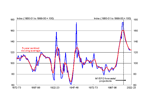
The terms of trade peaked in 2011/12, and have been declining since then. Most analysts expect this decline to continue, as the global supply of bulk commodities continues to rise rapidly.2
An interesting and important question is how far the terms of trade are likely to fall. In seeking to answer that question, Treasury has undertaken some detailed modelling that takes into account the three phases of the mining boom. These phases are the initial demand phase when there was a rapid rise in prices and a modest increase in supply; the current supply phase during which the capacity built over the demand phase is progressively employed, leading to a rapid increase in supply and falling prices; and an expected balanced growth (or long-run) phase where demand and supply are expected to move broadly together, with the terms of trade displaying no secular trend.
The new modelling approach was used for the first time as the basis of the terms of trade projections for the December 2013 Mid-Year Economic and Fiscal Outlook.3
The new approach uses a variety of techniques to model the main elements of the terms of trade (that is, for major export categories, volumes and export prices relative to the price of aggregate imports). These techniques include extensions of existing short-run econometric forecasting models, but the main part of the exercise involves detailed modelling of the evolving global demand/supply balance for each of the three (individual) bulk commodities of most importance for Australia (iron ore, metallurgical coal and thermal coal).4
The high level of the terms of trade has had a profound impact on the Australian real exchange rate, which for several years has remained well above its average since the dollar was floated in December 1983. This in turn continues to have a profound impact on the structure of the traded sector of the Australian economy. Those parts of the traded sector not linked in some way to the boom in the production of mining and energy commodities continue to face severe and sustained competitive pressure from foreign competitors.
Despite the recent depreciation of the nominal exchange rate, the real value of the Australian dollar remains more than 20 per cent above its post-float average (Chart 2). Given the outlook over the next several years for significant falls in both the terms of trade and investment in the mining and energy sectors, it seems likely that the necessary rebalancing of the Australian economy towards non-mining sources of growth will require a further decline in the real value of the Australian dollar.5
Chart 2: Australian real exchange rate and terms of trade
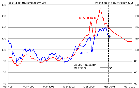
Note: The blue dot shows an estimate for the real TWI in the March quarter, 2014.
Participation
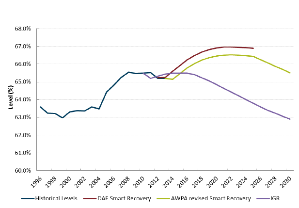
In preparation for the forum, authors were asked to comment on aspects of the scenario presented in Appendix A of the briefing paper for speakers. In my judgement, most aspects seem plausible, with the possible exception of the projected labour force participation rate, reproduced as Chart 3 below. The preferred projection, ‘AWPA revised Smart Recovery’, has the 15+ participation rate rising from its current level to around 66½ per cent by early next decade, and then declining gradually thereafter.6 By contrast, the 2010 Intergenerational Report (IGR) has the 15+ participation rate at around 65 per cent by early next decade, and declining more rapidly thereafter.
Chart 3: 15+ Participation Rate
In analysing labour force participation, it is important to recognise the strong correlation between educational attainment and participation.
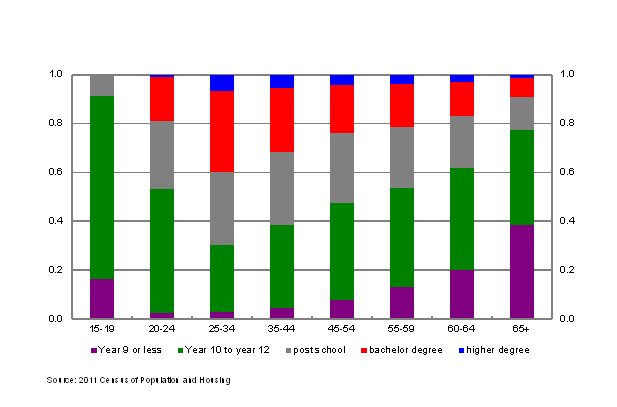
Charts 4 and 5 show participation rates and shares of the population, by level of education, for men of different ages from the 2011 Census. Charts 6 and 7 show the same data for women. As the charts show, people with higher levels of educational attainment have strikingly higher rates of labour force participation right across their lifecycles.
Chart 4: Male participation rates by level of education
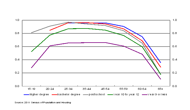
Chart 5: Male population proportions by level of education
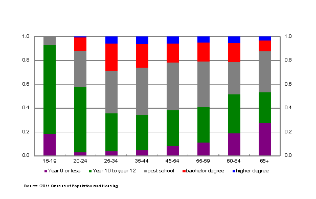
Chart 6: Fema
le participation rates by level of education
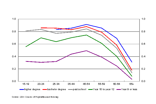
Chart 7: Female population proportions by level of education
Over time, the average level of education in the workforce is rising as older cohorts – with lower average levels of educational attainment – retire, and younger cohorts take their place. Given the correlation between education and participation, rising levels of education should lead to higher levels of labour force participation over time, other things equal.
As ever, other things are not equal. Of most relevance for future projections, the ageing of the population – with the first of the baby boomers having turned 65 in 2011 – is reducing the aggregate 15+ participation rate over time.
An attempt some time ago to quantify the participation effects of the rising level of education concluded that, while it should lead to a noticeable rise in the participation rate relative to what would otherwise occur, the rise would fall well short of that needed to generate a 15+ participation rate of 66½ per cent by early next decade (Gruen and Garbutt, 2003).7
In this context, it is also of interest to report on participation rate developments over the four years since the publication of the 2010 IGR.
For both men and women of prime age (25 to 54 years of age), participation rates over these four years have been quite close to those projected in the 2010 IGR.
For both men and women aged 55 and over, participation rates over the past four years have been more favourable than projected in the 2010 IGR; particularly for those aged 65 and over.
By contrast, for both men and women aged less than 25 years old, participation rates have been noticeably lower than projected in the 2010 IGR, with the difference most marked for men (boys actually) aged 15 to 19.
Of relevance to the longer-term profile for the participation rate is the question of how much of the recent weakness in youth participation rates is cyclical and how much structural.
Undoubtedly, some of the recent weakness is a discouraged worker effect in a labour market with an unemployment rate that has drifted up to 6 per cent in January 2014. That may be particularly important for these age groups given the disproportionate weakness in construction and retail trade employment, both industries with a concentration of young workers.8
But there may be also some structural factors behind the recent fall. In that category, better access to higher education may be playing a role, with the relaxation of government caps on university enrolment since 2010.
Taking into account these developments in participation rates for both the young and mature aged over the past four years, as well as allowing for a somewhat higher net immigration intake than the 180,000 per annum assumed in the 2010 IGR, leads to a projection for the 15+ participation rate a little lower over the remainder of this decade than the 2010 IGR projection, crossing over to be a little higher than the 2010 IGR projection over the 2020s.
In my view, then, the 15+ participation rate probably already reached its peak in late 2010 at just below 66 per cent, and is unlikely to return to those levels over the next couple of decades.
Projections of future employment shares by industry
Australian Treasury recently updated its modelling of the projected industrial structure of the Australian economy over the next several decades.9 It is of interest to compare the results of this exercise with those presented in the scenario for this forum.
In broad outline, the results from the two modelling exercises are quite similar. Australia’s comparative advantage is expected to continue to evolve in response to a range of economic developments and, as a result, so is the pattern of employment across the Australian economy. The economic developments of particular note are continuing strong growth in Asia (in turn generating rapidly rising numbers of Asians in the middle class with rising disposable incomes), developments in the terms of trade (largely a consequence of the evolving supply/demand balance in major resource commodities, discussed earlier), population ageing, and differential labour productivity growth across industries.
Australia’s services sectors, which currently account for more than three-quarters of total employment, are projected to continue to expand to meet growth in both domestic and international demand. The international dimension represents predominantly the rapidly increasing membership of the Asian middle class with their rising demand for a broad range of services, including tourism, education, health and aged care, entertainment, financial and professional services. Employment in the (Australian) services sectors is projected to grow by around 30 per cent to 2030.
While mining accounts for a small share of employment, mining output is expected to grow strongly over the remainder of the decade as the enormous levels of investment in the sector progressively come on stream.10 Gas extraction, for liquefaction and export, is expected to expand particularly rapidly. As the terms of trade fall from current high levels, employment growth in mining is projected to moderate from 2020 to 2030.
The level of employment in the manufacturing sector as a whole is projected to remain fairly unchanged over the period to 2020, with continued growth in areas like food manufacturing offsetting declines in heavy manufacturing. Manufacturing employment returns to growth in the following decade, albeit at a slower pace than the economy as a whole.
As with manufacturing, the level of agricultural production and exports has been adversely affected by the high exchange rate over recent years and the near-term outlook is for moderate growth. After 2020, rising international demand, particularly from Asia, and improved competitiveness from a declining real exchange rate expands production across all major agricultural commodities.
Construction output continues to grow, but at a slower pace than in recent years as the peak in mining investment passes. The construction share of employment in the economy declines over time from its recent high level.
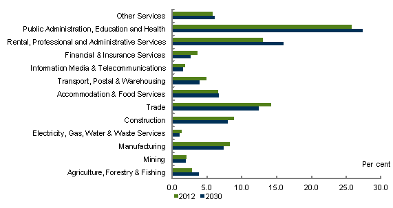
Chart 8: Industry shares of employment
Source: Treasury and DIICCSRTE (2013). ‘No Carbon Price’ Climate Change Mitigation Scenario.
Charts 9 and 10 below show the employment shares by industry and the change in these shares from 2012 to 2030, aggregated to be as comparable as possible to Figures 7 and 8 in AWPA’s briefing paper for speakers.11 Comparing the results of the Treasury modelling with Figure 8 of the AWPA document, the change in shares is similar for both mining and construction. However, there are differences in agriculture, manufacturing and services. The AWPA modelling finds:
- a larger increase in the services industry employment share (4.2 percentage points compared to 1.0 percentage points in the Treasury modelling);
- a larger decrease in manufacturing industry employment share (3.6 percentag
e points compared to 0.9 percentage points in the Treasury modelling); and - a fall in the agriculture industry employment share of about 0.9 percentage points compared to a rise of 1.0 percentage point from the Treasury modelling.12
Chart 9: Employment shares by industry, 2012 and 2030
Source: Treasury and DIICCSRTE (2013). Unpublished data.
Chart 10: Change in employment shares by industry from 2012 to 2030
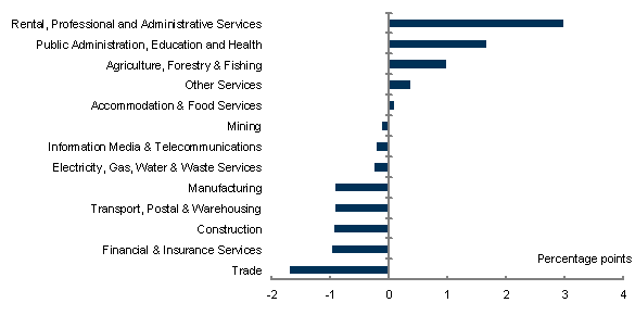
Source: Treasury and DIICCSRTE (2013). Unpublished data.
References
Climate Change Mitigation Scenarios: modelling report provided to the Climate Change Authority in support of its Caps and Target review (2013), available on the
Climate Change Authority website.
Filatriau, Olivier and Frédéric Reynès (2012) ‘A New Estimate of Discouraged and Additional Worker Effects on Labor Participation by Sex and Age in OECD Countries’, Working Paper 2012-09, French Economic Observatory, available on the
French Economic Observatory website.
Gruen, David (2011), ‘Economic and financial trends and globalisation over the next 15 years and how they will influence the supply and demand for skills’, available on
Gruen, David and Matthew Garbutt (2003), ‘The Output Implications of Higher Labour Force Participation’, Treasury Working Paper 2003-02, available on
Linehan, V. et.al., (2013) ‘Global food production and prices to 2050: scenario analysis under policy assumptions’, ABARES conference paper 13.6, Canberra, March 2013’ available on
the Australian Bureau of Agricultural and Resource Economics and Sciences website.
* I am grateful to Lucy Lu, John O’Leary and Daniel Silva Withmory for much help with this address.
2 The most important bulk commodities for Australia (with 2012-13 value shares of total exports of goods and services in parentheses) are iron ore (19 per cent), other mineral fuels – predominantly LNG and oil (9 per cent), metallurgical coal (7 per cent), thermal coal (5 per cent), and gold (5 per cent).
3 The previous approach, used in Budget documents since the 2010-11 Budget, made the assumption that beyond the near-term forecast horizon, the terms of trade would fall by 20 per cent over the subsequent 15 years. That approach was clearly silent on when the expected decline would end and the level at which the terms of trade would eventually settle.
4 The new modelling approach suggests the supply phase will end around 2017-18 with the long-run terms of trade settling around their 2006-07 level. To be prudent, the projections used for the 2013 MYEFO (shown in Chart 1) assume a slightly lower long-run level for the terms of trade; namely, the level last observed in 2005-06, assumed to be reached in 2019-20.
5 Beyond the short-term forecasting horizon, the economic analysis underpinning the MYEFO projections assumes the real exchange rate moves proportionately with the terms of trade, in line with historical experience. The terms of trade projections shown in Chart 2 imply a fall in the real TWI of about 8 per cent over the projection period.
6 The projections shown in Chart 3 were sent to speakers in late December. An updated central scenario, sent out last week, has a lower participation rate projection than the preferred projection shown in Chart 3, although it continues to show a sizeable recovery in the participation rate to above 66 later this decade, which still seems too optimistic to me. The latest data, for January 2014, has the 15+ participation rate at 64½ per cent, although this outcome is likely below its trend rate because of discouraged worker effects in a labour market with an unemployment rate of 6 per cent.
7 Gruen and Garbutt report 15+ participation rates of about 66½ by 2020 assuming Australian age-and-gender-specific participation rates reach the (then) 80th percentile of OECD experience by that date. They also show (their Figure 12) that rising education levels should raise participation for all ages and both genders, but that the resulting participation rates remain much lower than those at the (then) 80th percentile of the OECD. Gruen and Garbutt based their work on the 2001 Census and the 2002-03 IGR, and outcomes for participation have been more favourable than anticipated at that time. Nevertheless, based on their work, rising education levels do not appear to have a sufficiently powerful effect on participation to explain the large differences between the participation rates projected in the ‘AWPA revised Smart Recovery’ scenario and the 2010 IGR shown in Chart 3.
8 There is also some cross-country evidence suggesting that discouraged worker effects are larger for the young, and particularly for men aged 15 to 19 (Filatriau and Reynès, 2012). However, the falls in participation rates for young people in Australia over the past four years have been significantly larger than can be explained by this international evidence.
9 The modelling used the MMRF computable general equilibrium model, and was conducted jointly by Treasury and the former Department of Industry, Innovation, Climate Change, Science, Research and Tertiary Education. The results shown here use the ‘no carbon price’ scenario published in Climate Change Mitigation Scenarios: modelling report provided to the Climate Change Authority in support of its Caps and Target review (2013).
10 By 2014-15, the capital stock in the mining and energy sector is expected to be nearly four times its pre-boom level.
11 Strict comparability is thwarted by different industry classifications, with the Treasury modelling using ANZSIC 1993, while the AWPA modelling uses ANZSIC 2006.
12 Note that the relatively fast growth in th
e agriculture sector in the Treasury modelling is not a standard result. For example, ABARES long-term food production projections are weaker (Linehan, V. et.al., 2013). Projections for agriculture depend, of course, on assumptions about demand growth in Asia, access to land and productivity growth in different regions.