Downloads
Introduction
Good morning.
It is a pleasure to be with you today at this year's Tasmanian Economic Forum.
My talk today is on the Economic Outlook1. In particular I will focus on what the Global Financial Crisis – including its lead-up, the macroeconomic policy response and aftermath – tells us about the economic outlook.
While I hope this topic is interesting of itself, my broader goal is to provide a broader context for the remainder of the day's discussion.
Pre-crisis Economic & Financial Market Conditions
Economic and financial market conditions prior to the onset of the crisis were not "normal".
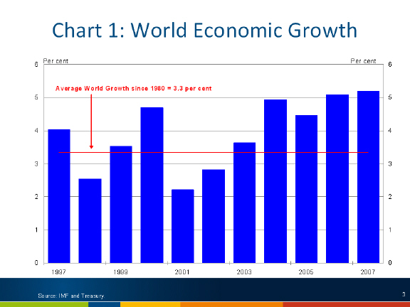
The world economy had seen an extended period of above trend growth. At the start of 2008, the world economy had been growing above trend for the past 5 years.
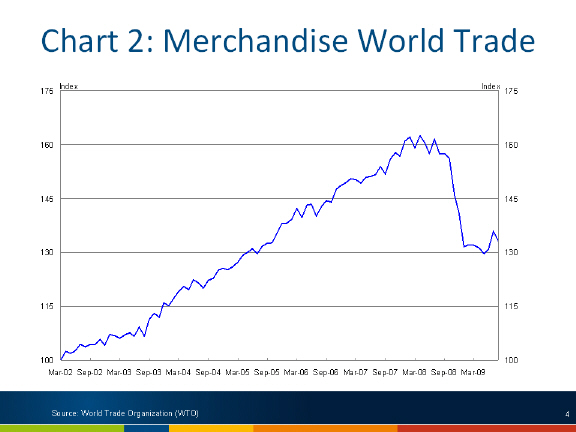
This was reflected in a prolonged period of strong growth in world trade. From 2002 to 2007 merchandise world trade grew by 50 per cent.
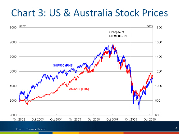
Financial markets had also enjoyed a prolonged period of strong growth in the years leading up to the crisis.
The Australian stock market more than doubled over the 5 years from late 2002 to its pre-crisis peak in November 2007. A similar pattern was evident in the US.
A key part of the explanation of the rise in global equity markets was a significant reduction in the price of risk.
One measure of this is the spread on 5 year US corporate bond yields to US Treasury bonds. The spread on B rated corporate bonds fell from around 800 basis points in 2002 to less than 300 basis points in mid 2007: a fall of over 60 per cent.
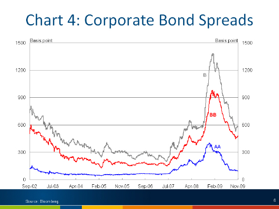
Implicit within this compression of spreads is a shift in the relative return for bearing of risk: that is, not only was the spread on low risk (AA) bonds falling, the spread on high risk (B-rated) bonds was falling even faster.
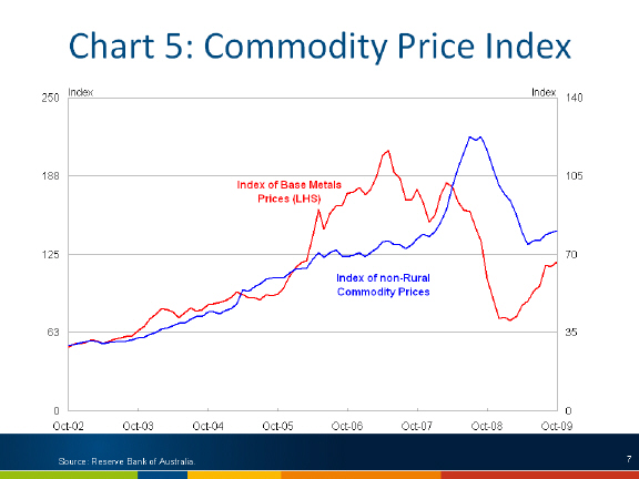
Strong global demand for mineral commodities, along with lags in supply and buoyant financial markets, saw significant increases in mineral commodity prices over this period. The RBA Base Metals index (weighted by export share) was four times higher at its peak in May 2007 than it was in September 2002 less than five years before. The broader non-rural index (which includes bulk commodities iron ore and coal) increased by about the same amount, but did not peak until July 2008.
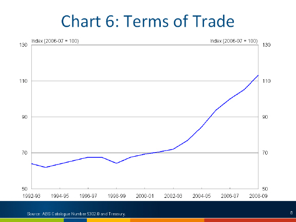
This was a key driver in the surge of Australia's terms of trade over this period, peaking around 60 per cent above its long run average in 2008-09.
The Impact of the Global Financial Crisis
The Global Financial Crisis had a dramatic impact on both financial markets and the real economy.
The impact was felt first in financial markets, where from mid 2007 the emerging US sub-prime crisis was leading to a re-evaluation of risk and asset prices.
But the impact was considerably more pronounced in the fallout following the collapse of Lehman Brothers.2
By the end of 2008, risk aversion had taken hold. Bond spreads soared – even for AA bonds - re-tracing all of the "gains" of the past 5 years.

Similarly, equity prices collapsed, falling by more than half from their peak.

The effects of the Global Financial Crisis rapidly spread to the real economy. World trade fell by over 20 per cent from its peak in April 2008 to May 2009, to be around the same level as in July 2005.

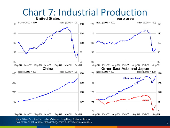
The September quarter 2008 saw significant falls in global industrial production.
These events led forecasters around the world to dramatically revise their near term forecasts. After an upward revision to their global growth forecast as recently as July 2008 to nearly 4 per cent (or a little above trend), the IMF progressively reduced this forecasts in a series of rapid revisions to around -1 per cent.
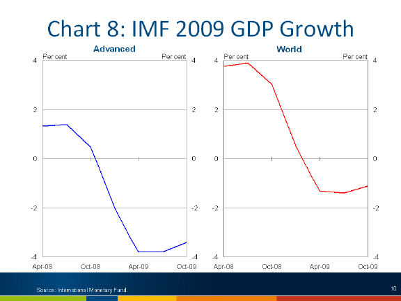
The point of this is not to criticise the IMF's forecasts, but rather to understand the magnitude of the events that were unfolding at the time – something that we can quickly forget when things turn out better than expected.
In its April 2009 World Economic Outlook the IMF published an analysis of economic fluctuations of 21 OECD countries over the past 48 years.
The IMF noted that recessions associated with a financial crisis or that are highly synchronised across the world tended to last longer than other recessions, be more severe and the recovery was slower and weaker.
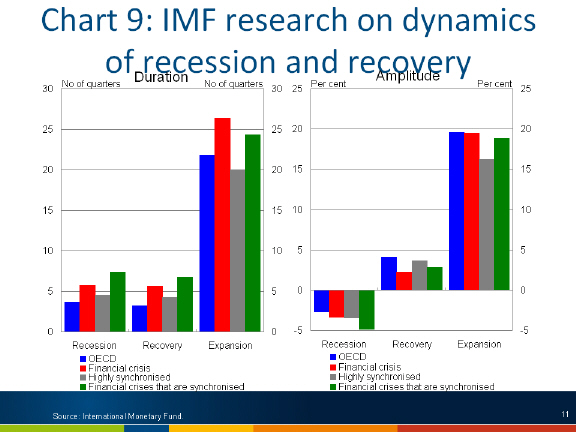
With the rare combination of a downturn that was both highly synchronised and associated with a severe financial crisis, a significant policy response was required.
The Policy Response to the Financial Crisis
The Australian macroeconomic policy response to the crisis was very large and very quick.
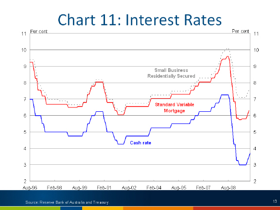
The RBA acted quickly to rapidly reduce the official cash rate. In the official cash rate was cut sharply in each of the four RBA Board meetings following the collapse of Lehman Brothers. Overall, the cash rate was cut by 425 basis points, from 7.25 per cent before the September 2008 meeting to 3.00 per cent after the April 2009 meeting.
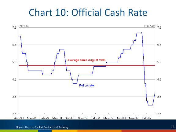
Importantly, despite the disruption in financial markets, monetary policy in Australia continued to be effective. Much of the reduction in the official cash rate flowed through to be reflected in borrowing rates of households and businesses.
The exchange rate fell sharply in the second half of 2008. However, while this initial fall has been positive for growth, the relatively short duration of the exchange rate trough, the volatility and the subsequent sharp reversal mean that the contribution to growth over the past year is likely to have been modest.

The Australian Government also acted quickly with significant fiscal stimulus to support aggregate demand in the economy.
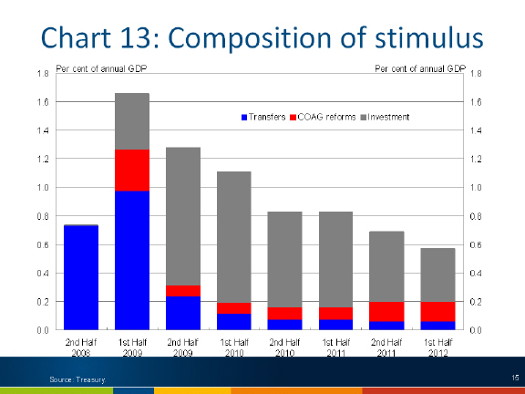
The Government's fiscal response to the crisis has been described as having three 'phases':
- Phase 1: Cash transfers to low and middle income households to provide immediate support to aggregate demand.
- Phase 2: Adding directly to aggregate demand by capital works projects that could be implemented quickly ('shovel ready' projects).
- Phase 3: Longer-term infrastructure projects.
Fiscal stimulus is estimated to have added around 1 percentage point to GDP growth in 2008-09 and is expected to add 1½ percentage points in 2009-10.
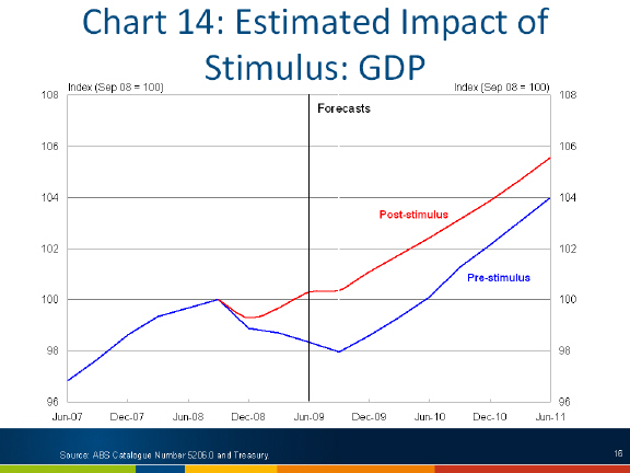
The stimulus measures have helped to soften the impact of the global recession on employment, with the forecast peak of 6¾ per cent around 1½ per cent lower than it would have been in the absence of fiscal stimulus.

Looking carefully at these charts you can see that the estimated impact of the stimulus declines over time – with the withdrawal of stimulus starting to detract from growth in 2010.

This reflects the fact that the stimulus measures are temporary and were designed to be withdrawn as private demand begins to recover.
Importantly, Australia's macroeconomic policy response has not occurred in isolation, with significant action in many other countries, particularly China.
The Economic Outlook
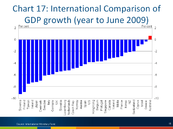
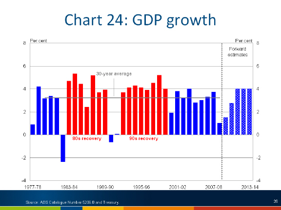
It is clear that the Australian economy has performed much better through the crisis than other advanced economies. The Australian economy grew by 0.6 per cent through the year to June 2009. No other advanced economy grew over this period.
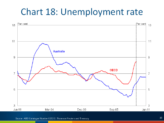
Australia's unemployment rate has remained low compared with other advanced economies.
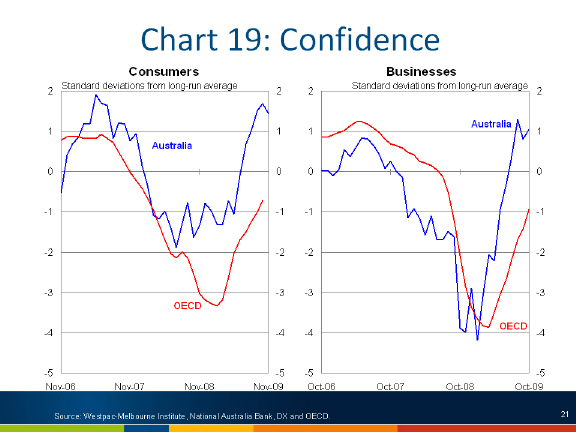
Consumer confidence in Australia fell by less than in other OECD countries and has rebounded faster. Business confidence fell by more, but has also rebounded more sharply here than elsewhere.
The emerging data supports the view that Australia's macroeconomic policy response has made an important contribution to this outcome.
Direct payments to households and lower interest rates have helped retail sales remain buoyant in Australia.
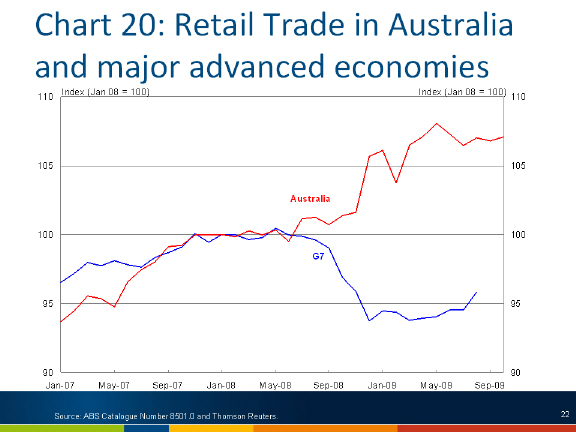
The effects of the first phase of the stimulus – direct payments to households – on retail trade are now abating.
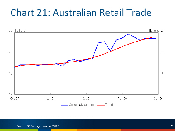
The next phases of stimulus – involving public construction projects – are underway, with strong growth in public construction offsetting weakness in private construction work done.
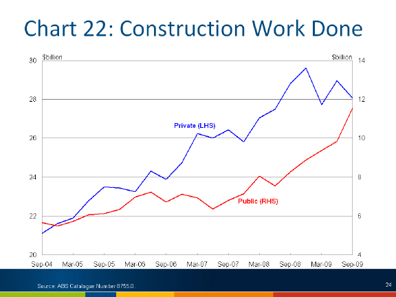
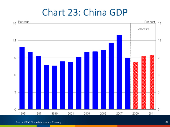
Strong recovery in demand from China in 2009 has seen Australia's export volumes hold up considerably better than in other advanced economies. On the back of aggressive monetary and fiscal stimulus, China's economy is expected to grow by 8¼ per cent in 2009, before accelerating to 9¼ per cent in 2010 and 9½ per cent in 2011.
Nevertheless, the Australian economy is expected to remain below capacity for some time to come. Three years of below trend growth are expected as a result of the downturn, before the output gap starts to close with above trend growth of 4 per cent from 2011-12 to 2014-15.
Tasmania and the GFC
What does all this mean for Tasmania?
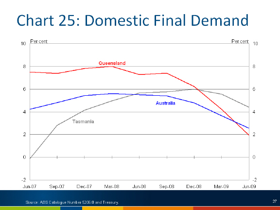
The first observation is that Tasmania has gone from having significantly lower than average domestic demand growth in the lead up to the crisis to growth above the national average during the downturn.
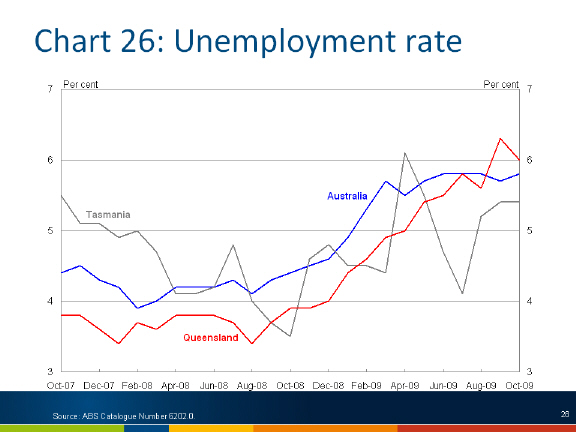
Similarly, Tasmania's unemployment rate has gone from being above the national average in 2007 to being well below the national average for all but 3 of the 13 months since the collapse of Lehman Brothers in September 2008.
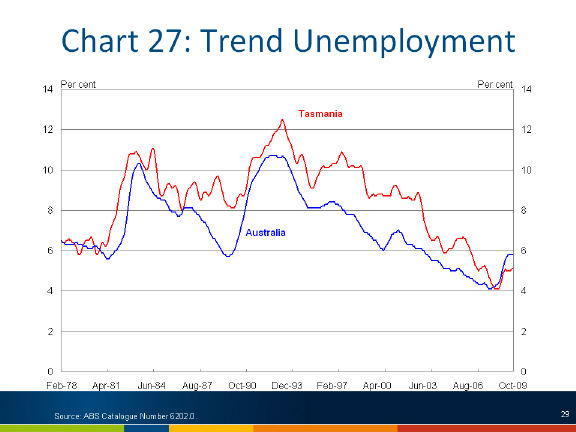
This performance is even more striking when put in a longer term context than Tasmania's unemployment rate has consistently been higher than the national average.
Last month the Assistant Treasurer noted that immediate support of over half a billion dollars had been provided to Tasmanians in Tax Bonus Payments and cash payments provided under the Economic Security Strategy and Nation Building and Jobs Plan packages.
This represents nearly 2½ per cent of Gross State Product in targeted transfers to low and middle income Tasmanians, compared with the national average of 2 per cent of GDP. So part of the explanation of why the Tasmanian economy has relatively performed well in this downturn so far is that it has received a higher share of the first phase of the fiscal stimulus.
Why is this so? Simply that Tasmania has more low and middle income earners than the national average.
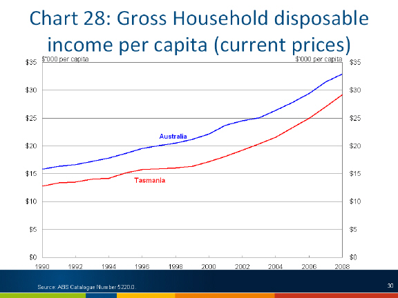
Tasmania's employment to population ratio has consistently been well below the national average.
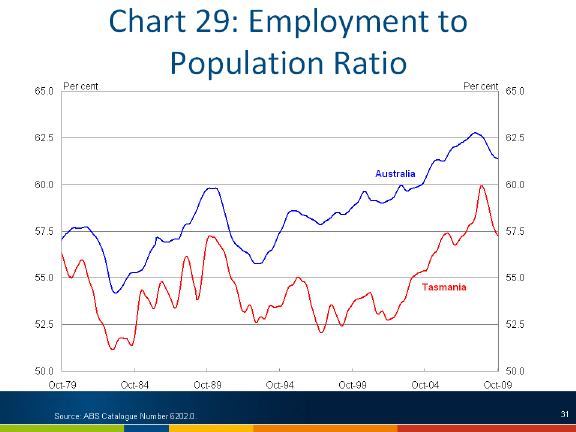
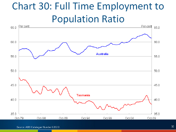
This trend is even more evident in the ratio of full-time employment to population.
Future Challenges
Finally, I would like to briefly mention the four, large, long term forces outlined in a recent speech by the Secretary to the Treasury, Dr Ken Henry.
- Population ageing, and the projected increase in population from about 22 million today to 35 million in 2049, an increase of 13 million
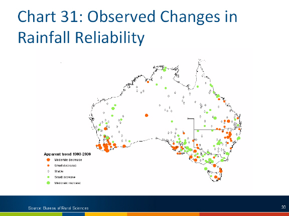
people, or around 60 per cent. - Climate change adaptation and mitigation. The science tells us that Australia's climate will change over the coming century. And while an already dry continent will become drier, there is good reason to consider that the impact will be quite different in different parts of the country.
The same science tells us that our climate will become more variable, with more extreme weather events affecting the places where people live.
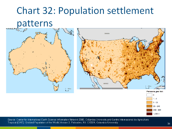
- The continuing impact of the diffusion of information and communications technologies. Developments in information and communication technologies have already helped to reduce the 'tyranny of distance' that separates Australia from major global markets – a significant part of the historical explanation for our GDP per capita lagging that of the United States.
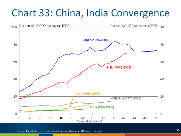
- Last, but by no means least, the re-emergence of China and India as global economic powers. China and India are only in the early stages of catching up with the living standards of the developed world, and this process could have a very long way to run. To get the full benefit of the elevated terms-of-trade, the share of our factors of production allocated to the resource sector will need to increase.
Conclusion
To conclude, while Tasmania's economy has performed well through the current downturn, there are long term structural forces that will have potentially profound impacts in the future.
Just how those structural changes play out depends critically on the quality of the policy settings and decisions taken today.
Thank you.
1 I would like to thank Ben Ralston and Xiao Chun Xu for their assistance in the preparation of this presentation.
2 Interestingly, the financial market turmoil largely followed the testimony of Secretary Paulson and Chairman Bernanke about a week after the Lehman Brothers collapse.