Michael Fletcher and Ben Guttmann1
Introduction
There is a keen national and international interest in the topic of income inequality. The release by the Organisation for Economic Co-operation and Development (OECD) of their reports Growing Unequal (OECD 2008) in October 2008 and Divided We Stand (OECD 2011) in December 2011 sparked international commentary and led the World Economic Forum to declare that inequality was a top economic risk.
Over the past twenty years, Australia has experienced a period of sustained economic growth. This has resulted in an increase in earnings from both labour and capital, which has benefited households across the income distribution (Greenville et al. 2013) and has led Australia to have the second highest ‘average’ income growth between the mid-1990s and the late 2000s amongst OECD nations. During this period, Australians in the bottom 10 per cent of the income distribution have experienced the fifth highest income growth in the OECD, at 3 per cent per annum.
It is this strong growth across the income distribution that sets Australia apart from other OECD countries.
Nevertheless, while labour income inequality has been on the decline, overall income inequality in Australia has been rising since the mid-1990s. Measures that focus on the very top income earners show a strong gain in their share of national income, as is the case in most OECD countries.
Despite all the research by the OECD and many others, the policy implications of income inequality remain unclear. For example, a more equal income distribution does not necessarily lead to a higher standard of living for any group in society, and rising or falling income inequality by itself cannot be categorically labelled as bad or good without an understanding of the underlying causes. This is particularly pertinent in the Australian context, given that an upward trend in income inequality since the mid-1990s has also coincided with a period of sustained economic growth.
We do know that there are complex trade-offs between equity and efficiency objectives in policy settings, and that a singular focus on equity without regard to efficiency can be counterproductive for both. In this article we take a broad perspective by looking at aggregate trends in income inequality, rather than trying to disaggregate the effects of individual policy changes.
In addition, income, while valued because of its ability to support consumption choices, is not the only thing that matters when considering inequality. Equality of access to health, education, housing and community safety — just to name a few — are also important, especially at the lower end of the income distribution. This makes measures of poverty in Australia also relevant when considering the implications of changing trends in income inequality.
This paper examines income inequality in Australia, how we compare with other countries and what might be driving our results. In doing so, the paper aims to contribute to a better understanding of income inequality by drawing on a variety of measures.
We then ask the questions: ‘How much should we care about income inequality?’ especially in circumstance such as Australia’s where most people are doing better, and ‘what are the implications for policy makers?’
Measuring income inequality
There are a number of different definitions of income, different sources of income data, and several different ways in which income inequality can be measured.
It is important to be aware of these differences, particularly the advantages and disadvantages of the different data sets and measures, as, by themselves, individual measures can be misleading. A clearer picture of income inequality can only be obtained by using a broad range of measures.
Income data by household is collected around every two years by the Australian Bureau of Statistics (ABS) Survey of Income and Housing, and adjusted or equivalised by the ABS to take into account the fact that larger households need a higher income to achieve the same standard of living as smaller households.
The question of what should be included in a definition of income is a challenging one, as there are many ‘non-cash’ benefits provided by governments — such as public health and education — which are also important for comparisons of household consumption and wellbeing.
Unless otherwise specified all the charts and analysis in this paper are based on ‘equivalised household disposable income’, since this is the definition of income that most closely represents the income in people’s pockets that is available to support their consumption choices. Equivalised household disposable income is made up of market income plus cash transfers provided from the government, less direct taxes.
These income surveys are used to construct a range of measures of income inequality.
The most common measure of income inequality in the literature is the Gini coefficient which is generally used to examine changes in income inequality over time and between countries. The Gini coefficient has a value between zero and one, where zero is perfect equality and one is perfect inequality. The Gini coefficient is particularly sensitive to changes in the definition of income and to changes at the level of median income as this is where most of the people in the distribution are. However, it does not tell us about changes in the distribution of inequality between income groups, such as the top and the bottom.
Another common measure is to compare the income of households at particular positions in the income distribution. This can be done by using income ratios, such as the P80/P20 which compares the income received by those at the 80th income percentile (a person who is at the top 20 per cent of the income distribution) with those at the 20th income percentile (a person who is at the bottom 20 per cent of the income distribution). These point-to-point estimates enable us to compare the distribution of income at different points in the distribution (rather than across the whole distribution like the Gini coefficient).
It is also possible to calculate the share of national income that goes to high, middle and low income earners, or alternatively, to compare the level and growth in income for particular income deciles, such as the top and bottom 10 per cent.
Incorporating analysis on income levels at different points in the distribution is vital to understanding inequality since a reduction in the Gini coefficient could result from a fall in incomes at the top, without a corresponding rise in incomes at the bottom (that is people becoming more equally poor). By analysing income levels, we can get a better understanding of the possible explanations for movements in the Gini coefficient. Additionally, while relative incomes do seem to matter for wellbeing, we should not discount that absolute income provides the basis for a particular standard of living (see for example Stiglitz 2012).
While the use of income surveys to estimate measures of income inequality is widespread, they have limitations. For example, the surveys on which they are based tend not to represent well those people at the top and bottom of the income distribution, as these people are less inclined to participate. In addition, like all surveys, the results are based on a sample of the population at a particular point in time. Changes in income definitions can also make comparing results over time difficult. In particular, the ABS’s decision to include some cash and non-cash benefits provided to employees (such as termination payments, irregular overtime and bonuses) from 2003-04, has had the effect of increasing measured income inequality over this period.
In addition to income survey data, taxation data can also be used to measure income inequality. Taxation data tends to be used to calculate measures of income inequality at the top of the distribution. This data is more comprehensive and provides a longer time series than survey data for those individuals who submit tax returns; however, its key disadvantage is that it does not include those at the lower end of the income scale who do not pay income tax. Tax data is also subject to changes in the definition of taxable income from time to time.
As mentioned above, measures of income inequality do not necessarily illuminate changes in absolute income that is required for a minimum standard of living. This is especially true at the bottom end of the income distribution where we may be concerned about poverty.
This paper does not examine measures of poverty and entrenched disadvantage, which while related to aspects of income inequality, is a separate and substantial topic in its own right. A discussion of how poverty and other concepts of disadvantage are measured and a summary of results for Australia are contained in the recent Productivity Commission staff working paper entitled Deep and Persistent Disadvantage in Australia (McLachlan, Gilfillan and Gordon, 2013).
What does the data show for Australia?
In this section we explore a range of measures of income inequality to present as comprehensive a picture as possible of trends in income inequality in Australia.
Chart 1 shows the Australian Gini coefficient from 1982 until 2011-12. As noted earlier, the income definition used is household disposable income, sourced from the ABS Survey of Income and Housing, and equivalised for family size.
The blue line shows the old ABS annual income measure, while the red and grey lines use a weekly income measure (with the grey line using a broader income definition which includes the changes since 2003-04 discussed earlier).
Although the three lines are not directly comparable because of changes in the income definition, and noting that there have been both upward and downward movements, over the long term we can see a slight positive trend in the Gini coefficient. This suggests that the income distribution in Australia has become more unequal over the last 30 years.
Chart 1: Gini Coefficient in Australia from 1982 until 2011-12
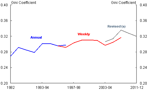
(a) The Revised trend uses a different definition for income and is therefore not directly comparable.
Source: Jonson and Wilkins (2006), Whiteford (2013) and ABS (2013).
Note: Horizontal axis corresponds to survey release dates. The interval between surveys varies.
Chart 2 sets out the Gini coefficients for each state in Australia. It shows that the Gini coefficient trends for all the states except Western Australia follow the same pattern as the overall measure. Western Australia has continued to experience rising income inequality since 2007-08. While further work is needed to better understand this trend, it is likely that the increase in income inequality in Western Australia is due to the impact of the mining boom in that state.
Chart 2: Gini Coefficient for the States
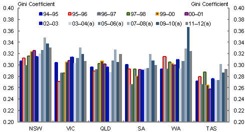
(a) The revised trend uses a different definition for income and is therefore not directly comparable.
Source: Australian Bureau of Statistics (ABS cat no. 6523.0).
Note: Horizontal axis corresponds to survey release dates. The interval between surveys varies.
Chart 3 contains a comparison of income for households using three ratios: the P90/P10 which is the ratio of income at the top (90th percentile) and bottom (10th percentile), the P80/P20 which is the ratio of income at the 80th and 20th percentiles, and the P80/P50 which is the ratio of income at the 80th and 50th percentiles.
The chart shows that in 2011-12, a household at the 80th income percentile had around 2.61 times the weekly household disposable income of a household at the 20th percentile and around 1.56 times the income of a household at the 50th percentile. A household at the 90th percentile had around 4.1 times the weekly household disposable income of a household at the 10th percentile.
Overall, between 1994-95 and 2011-12 the P80/P20 and the P80/P50 ratios have been fairly steady, with periods of small variation.
The P90/P10 line shows a steeper upwards trend than the other two data lines, with a pronounced drop occurring from 2007-08 to 2011-12. These findings are similar to the trend in the Gini coefficient, and are probably due to rises in investment incomes over this period which accrued mostly to those at the top of the income distribution. This correlation continues with the onset of the global financial crisis (GFC) and the subsequent fall in asset prices, particularly on the stock market, which shows up as a reduction in the P90/P10 ratio.
Chart 3: P90/P10, P80/P50 and P80/P20 ratios in Australia from 1994-95 to 2011-12
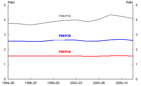
Source: Australian Bureau of Statistics (ABS cat no. 6523.0).
Note: Horizontal axis corresponds to survey release dates. The interval between surveys varies.
In order to put the changes in income inequality that have occurred in Australia in context, it is important to have an understanding of how real incomes have changed over the same period.
Chart 4: Real income growth in Australia at certain percentiles from 1994-95 to 2011-12
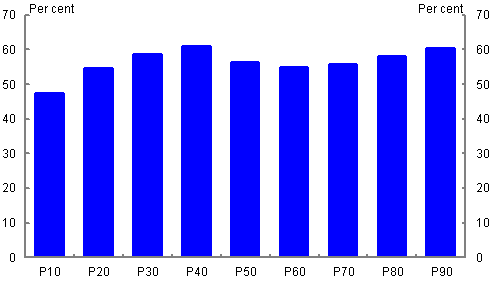
Source: Australian Bureau of Statistics (ABS cat no. 6523.0).
Chart 4 shows that from 1994-95 until 2011-12, there has been real household income growth across the income distribution, with the biggest gains going to those at the 40th, 80th and 90th percentiles. Greenville et al. (2013) conclude that the increase at the lower end is mainly due to the ‘growth in labour force earnings, arising from employment growth, more hours worked (by part-time workers) and increased hourly wages’, while those at the top end have benefited most from large gains in investment returns.
A key driver of real household disposable income growth in recent years has been the income effect arising from our terms of trade. Strong world demand for Australia’s mineral exports has resulted in increased profits and real wages in the resources and related sectors, and increased revenues for governments, with flow-on effects across the economy. This has contributed to higher real disposable incomes overall than would otherwise have been the case.
We can further extend our a nalysis by looking at changes in income inequality by household type.
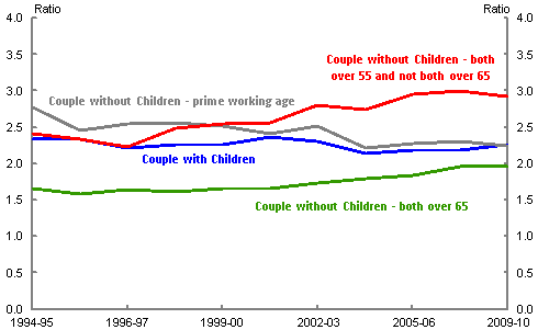
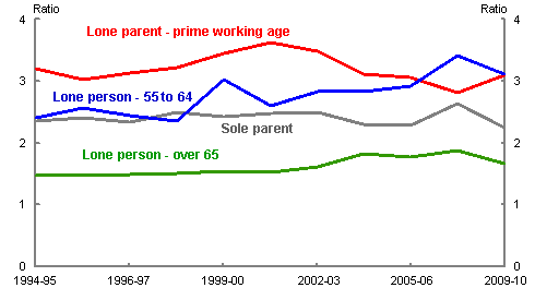
Charts 5 and 6 contains the P80/P20 ratio for a number of different household types (Chart 5 contains households with couples while chart 6 contains households with singles).
We can see a clear increase in the ratio for those households in the 55 to 64 year old age group. There are a number of possible factors which influence these findings. These include: increases in the rate of return on investments; changes in the tax-transfer system which have benefited high income earners; increased access to the labour market, especially for women; changes in education patterns; and people having children later.
Chart 5: P80/P20 for different couple household types in Australia from 1994-95 to 2009-10
Source: Australian Bureau of Statistics (ABS cat no. 6523.0) and Treasury.
Note: Horizontal axis corresponds to survey release dates. The interval between surveys varies.
Chart 6: P80/P20 for different single household types in Australia from 1994-95 to 2009-10
Source: Australian Bureau of Statistics (ABS cat no. 6523.0) and Treasury.
Note: Horizontal axis corresponds to survey release dates. The interval between surveys varies.
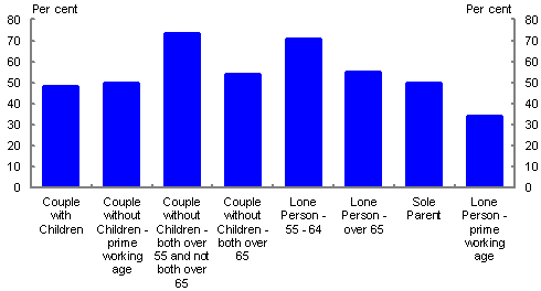
Chart 7 brings together changes in real income growth and household specific outcomes by breaking down changes in real disposable household income by household type for the period from 1994-95 to 2009-10.
While all of the household categories have experienced significant real income growth, the biggest gains have gone to singles between the age of 55 and 64 and couples without children, where both members are 55 or above and at least one member is below 65. However, these age group categories also experienced the biggest increases in income inequality (charts 5 and 6). As outlined above, this period of strong income growth for those between the ages of 55 and 64 coincides with a period of strong growth in investment income and increased labour force participation, suggesting that people in this age bracket have particularly benefited from these trends.
Chart 7: Real growth in disposable household income in Australia by household type from 1994-95 to 2009-10
Source: Australian Bureau of Statistics (ABS cat no. 6523.0) and Treasury.
In addition to looking at relative incomes at different points on the income distribution, we can also examine the share of income which goes to individuals at different levels of the income spectrum.
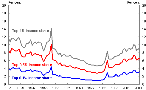
Chart 8, which is reproduced from Atkinson and Leigh (2006), shows changes in the share of income received by the top 1, 0.5 and 0.1 per cent of income earners in Australia from 1921 until 2010. This chart, which is constructed from taxation data, shows a gradual reduction in the share of income held by the top 1 per cent from the 1920s until the 1980s at which point it starts to increase again. The authors suggest that the change in the trend may be caused by a number of factors: higher executive pay, caused by the internationalisation of the chief executive market; the reduction in top income tax rates in the 1980s and 1990s; skill-biased technological change; and changes in societal norms relating to inequality.
Chart 8: Income share of top 1, 0.5 and 0.1 per cent in Australia from 1921-2010
Source: Atkinson and Leigh (2006).
Note: Data has been updated from
http://www.andrewleigh.com/blog/?cat=29.
Putting Australian trends into an International perspective
In this section we consider how changes in the distribution and growth of income in Australia compare with other OECD nations.
In the next two charts we can see that income inequality in Australia looks to have increased relative to the OECD average, between the mid-1990s and today.
Our Gini coefficient (at 0.309) was the same as the average in the OECD in 1995 (chart 9), but at 0.334, it was above the OECD average in 2010 (Chart 10). This increase is larger than the average increase across the OECD from 0.309 to 0.314. However, some of this increase is due to the change in the ABS definition of income that was discussed earlier.
Chart 9: Gini coefficient for OECD nations at around 1995
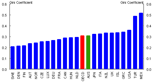
Note: Gini coefficient is from 1994 for Greece, the United Kingdom, Turkey and Mexico and from 1996 for Denmark, Austria, the Czech Republic, Luxembourg and France.
Source: OECD.stat Database.
Chart 10: Gini coefficient for OECD nations at around 2010
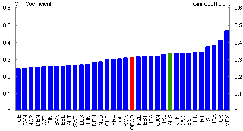
Note: Gini coefficient is from 2009 for Hungary, Ireland, Japan, New Zealand, Switzerland and Turkey and from 2011 for South Korea and Chile.
Source: OECD.stat Database.
As stated earlier, it is important to have an understanding of the level as well as the distribution of income, in order to understand changes in income inequality.
Chart 11 plots average annual disposable household income growth against the difference in income growth between the top and bottom income deciles. This chart suggests that there is no correlation between the magnitude of income growth and how it is distributed across the income spectrum.
A limitation of this chart is that the data for some countries does not cover the entire time period. Additionally, this chart involves a number of point-to-point estimates which need to be treated with caution. Nevertheless, based on the most consistent data available we see that over this period, Australia has experienced considerably higher average annual income growth at 3.5 per cent (from 1995 to the late 2000s), compared to the OECD average of 1.7 per cent (from mid-1980s until late 2000s).
The only other countries which experienced similar levels of average income growth over the period are Ireland and Spain.
While Australia experienced relatively high disparities in growth between the bottom and top deciles (at 1.5 per cent), we also had the fifth highest growth for the bottom decile at 3 per cent per annum from 1995 until the late 2000s. Again, Australia was only outperformed on this measure by countries which started from a lower base and whose economies are now much weaker, namely Portugal, Ireland, Greece and Spain. Since then, these countries have all experienced deep recessions while Australia’s economy has continued to grow.
Chart 11: Average annual income growth for OECD nations plotted against the difference between income growth at the 90th and 10th percentiles from 1985 to 2008
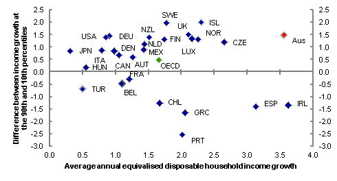
Note: Average annual changes are calculated over the period from 1985 to 2008, with a number of exceptions: 1983 was the earliest year for Austria, Belgium, and Sweden; 1984 for France, Italy, Mexico, Turkey and the United States; 1986 for Finland, Luxembourg, and Norway; 1987 for Ireland; 1988 for Greece; 1991 for Hungary; 1992 for the Czech Republic; 1995 for Australia and Portugal and 1996 for Chile. The latest year for Chile was 2009; for Denmark, Hungary, and Turkey it was 2007; and for Japan 2006. Changes exclude the years 2000 to 2004 for Austria, Belgium, Ireland, Portugal and Spain for which surveys were not comparable.
Source: OECD.stat Database and Greenville et al. (2013).
Chart 12 shows how income growth has fared in selected OECD nations between the onset of the GFC in 2007 and 2010. Over this period, Australia is one of only two countries which have seen income growth at the tenth percentile (approximately 0.8 per cent per annum) outperform income growth at the ninetieth percentile (approximately minus 1.3 per cent per annum). While these are only preliminary numbers and are dependent on when exactly the data were collected, it does appear that Australian households towards the bottom end of the income distribution fared better than equivalent households in other OECD countries (average income growth in the OECD at the 10th percentile was approximately minus 1.9 per cent per annum) (OECD 2013).
Chart 12: OECD household income growth between 2007 and 2010 for select OECD countries
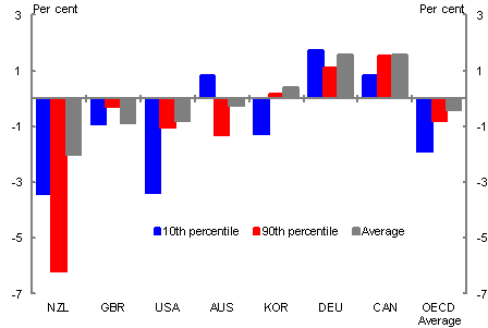
Note: Changes are calculated from 2008 for Australia, New Zealand, Germany and the United States.
Source: OECD stat Database.
What might be driving the Australian results?
As we have discussed in this paper, Australia has experienced a sustained period of solid real income growth across the distribution, along with a modest increase in income inequality. A working paper by the Productivity Commission on Trends in the Distribution of Income in Australia looked at the various components of income and how changes in these have affected the Gini coefficient up until 2009-10 (Greenville et al 2013).
Labour earnings are the largest component of income for most Australians, and therefore the most important driver of income inequality. Unlike equivalised final household income, labour earnings inequality has been falling in Australia at a household level since 1998-99.
This is because greater access to and participation in the workforce at the low end of the income distribution has more than offset the disproportionate increase in wages at the top (Greenville et al. 2013).
When Greenville et al. include capital and other income we see that market household income inequality (which includes labour, capital and other income) increased from 2003-04. The authors propose that the skewed distribution in earnings arising from capital investment more than offsets the reduction in inequality from labour income (Greenville et al. 2013). This trend of increasing labour and capital earnings over this time is due to the strong economic growth that Australia has experienced over the last two decades.
When the authors include direct government payments to give gross household income, the market income Gini coefficient for 2009-10 falls from 0.522 to a gross income Gini of 0.426 (Greenville et al. 2013). This is because direct government payments tend to be targeted to low income earners (Whiteford 2013). However, the extent to which direct government payments have reduced the Gini coefficient has fallen from 0.122 in 1993-94 to 0.096 in 2009-10. This is most likely due to the increase in employment rather than the effectiveness or targeting of the payments themselves (Greenville et al. 2013).
The inclusion of direct taxes (to give disposable household income) and the inclusion of government services and indirect taxes (final household income) reduce income inequality further. This is because individuals who earn more on average pay more taxes and because government benefits and services are of higher importance to people at the lower end of the income distribution. Overall, these resulted in a reduction in the Gini coefficient for 2009-10 from 0.426 for gross income, to 0.389 for disposable income and to 0.341 for final income (Greenville et al. 2013).
The extent to which direct taxes reduce inequality has lessened, with the difference between gross and disposable income falling from 0.047 to 0.037 from 1998-99 to 2009-10. This is due to the average share of taxes paid on income falling over the period, with the greatest reductions going to those towards the top end of the distribution (Whiteford 2013).
Lastly, Greenville et al. take into account the effect of household size and composition. This results in the Gini coefficient for 2009-10 decreasing further from 0.341 for final income to 0.270 for equivalised final income, since households with higher incomes on average have more members than households with lower incomes.
The ABS estimate of the Gini coefficient for equivalised disposable household income for 2009-10 is 0.328. We note that this is larger than the equivalised final household Gini estimated by Greenville et al. as the ABS definition does not include indirect taxes and government services in their estimate of income.
In terms of the potential policy implications of these developments, it is difficult to disentangle and quantify the impact of longer-term structural developments, such as demographic changes, cyclical impacts, such as the GFC, and specific policy changes.
However, it is our view that, overall, the economy has been the largest factor in driving change in income inequality. Employment growth has helped to reduce wage income inequality, while growth in investment income (at least up until the GFC) has tended to increase income inequality (particularly for groups such as retirees where investment income can be significant). These developments have meant that Australia’s tax and transfer system has been gradually playing a reduced role in determining the level of income inequality — partly because there is less work for it to do.
With this in mind, the next section takes a higher level view of the income inequality debate by asking the question ‘Should we care about income inequality?’
Should we care about income inequality?
There is no clear consensus on what an acceptable level of income inequality is. Societies will choose how much inequality they allow according to the institutions, norms, laws, policies and programs they adopt.
In Australia, like other OECD nations, there has been a trend towards greater income inequality since the mid-1990s, but there has also been very strong growth in incomes across the board, including the bottom decile of households.
As Stiglitz, Sen and Fitoussi (2009) from the Commission on the Measurement of Economic Performance and Social Progress have said: ‘If average income is increasing but at the same time inequality is increasing, it is not clear whether societal well-being is increasing or decreasing’.
Australia uses income-testing more than any other OECD nation, which allows for the greatest share of benefits to be targeted towards low income earners compared to any other OECD nation. The poorest 20 per cent of households in Australia receive 12.4 times the amount of cash benefits than the richest 20 per cent of households — the highest ratio in the OECD and about 50 per cent more than the next most targeted country, New Zealand (Whiteford 2013).
Additionally, according to the OECD (2008), Australia has one of the most progressive systems of direct taxation amongst OECD nations, mostly because lower income individuals pay lower amounts of income tax compared with other nations. This combination of factors had led Whiteford (2006) to argue that Australia has one of the most efficient tax and transfer systems of all OECD nations, although his definition of ‘efficient’ does not take into account behavioural effects from high effective marginal tax rates.
In terms of the extent to which we should be concerned about income inequality, the OECD has noted that simply shifting large amounts of money from high income earners to low income earners through the tax and transfer system is ‘neither an effective or sustainable way in which to lower income inequality over the long term’. (OECD 2011).
The OECD’s conclusion in Divided We Stand was that ensuring equal access for all of the population to high quality public services such as education, health and family care will help to reduce inequality and provide equal opportunities of personal and professional development for all citizens.
This suggests that some refocusing of the debate is required away from those at the very top of the income distribution towards those at the very bottom. Measures of income inequality do not do this well — lying beneath the averages are households that experience greater disadvantage than others. The Australian Social Inclusion Board estimates (using a variety of indicators) that 5 per cent (around 640,000 people) of Australians aged between 18 and 64 have multiple disadvantages. A greater focus on understanding and tackling multiple and entrenched disadvantage is critical in terms of improving overall wellbeing in Australia, notwithstanding that sustained economic growth and strong real income growth across the spectrum has delivered a great deal to Australians in recent years.
References
ABS (Australian Bureau of Statistics) 2013, ‘Household Income and Income Distribution’, Australia 2011-12, Cat. No. 6523.0, ABS, Canberra.
Atkinson, AB & Leigh, A, 2006, updated 2011, ‘The Distribution of Top Incomes in Australia’, ANU Centre for Economic Policy Research Discussion Paper No. 514., Canberra.
Economist Intelligence Unit 2005, ‘Quality of Life Index’.
Greenville, J, Pobke, C and Rogers, N 2013, ‘Trends in the Distribution of Income in Australia’, Productivity Commission Staff Working Paper, Canberra.
Gregory, B 2011, ‘The Resources Boom and Macroeconomic Policy in Australia — Australian Economic Report: Number 1’. Centre for Strategic Economic Studies, Victoria University, Melbourne.
Jonson, D and Wilkins, R 2006, ‘The causes of changes in the distribution of family income in Australia, 1982 to 1997–98’, Social Policy Research Paper Number 27, Department of Families, Community Services and Indigenous Affairs, Canberra.
Leigh, A 2013, Inequality data,
http://www.andrewleigh.com/blog/?cat=29.
McLachlan, P, Gilfillan, G and Gordon, J 2013, ‘Deep and Persistent Disadvantage in Australia’, Productivity Commission Staff Working Paper, Canberra.
OECD (Organization for Economic Cooperation and Development) 2008, ‘Growing Unequal? Income Distribution and Poverty in OECD Countries, OECD Publishing, Paris.
OECD (Organization for Economic Cooperation and Development) 2011, Divided We Stand: Why Inequality Keeps Rising, OECD Publishing, Paris.
OECD (Organization for Economic Cooperation and Development) 2012, OECD.stat Extracts, Paris.
OECD (Organization for Economic Cooperation and Development) 2013, ‘Crisis squeezes income and puts pressure on inequality and poverty’, OECD Publishing, Paris.
Stiglitz, J 2012, ‘The Price of Inequality’, The Penguin Group, London.
Stiglitz, J, Sen, A and Fitoussi, J 2009, Report by the Commission on the Measurement of Economic Performance and Social Progress, Paris.
Whiteford, P 2006, ‘The Welfare Expenditure Debate: Economic Myths of the Left and the Right Revisited’, The Economic and Labour Relations Review, Sydney.
Whiteford, P 2013, ‘Australia: Inequality and Prosperity and their Impacts in a Radical Welfare State’. Crawford School of Public Policy, Australian National University, Canberra.
1 The authors are from Social Policy Division, the Australian Treasury. This article has benefited from comments and input from Amanda Cattermole, Darren Kennedy, Anthony King, Susie Kluth, Cecilia Karmel and Mark Bott.